SEMESTER 1 Week 13 & 14
Something Tangible
Connecting my A.I. models.
My success with training a rudimentary text-based a.i. model in weeks 11 and 12 meant that I could now move onto connecting the technology with my previously trained visual-based a.i. model to create my first technical prototype.
Due to time constraints, I intended for this prototype to be rather rudimentary as per my initial sketches in weeks 9 and 10. After all, who knew how long this process might even take. At this point I barely had some working knowledge of how A.I. tools work, and how python worked, and what sort of plugins and libraries I would need to get them to work. But, I had no idea how to connect all of them together.
Due to time constraints, I intended for this prototype to be rather rudimentary as per my initial sketches in weeks 9 and 10. After all, who knew how long this process might even take. At this point I barely had some working knowledge of how A.I. tools work, and how python worked, and what sort of plugins and libraries I would need to get them to work. But, I had no idea how to connect all of them together.
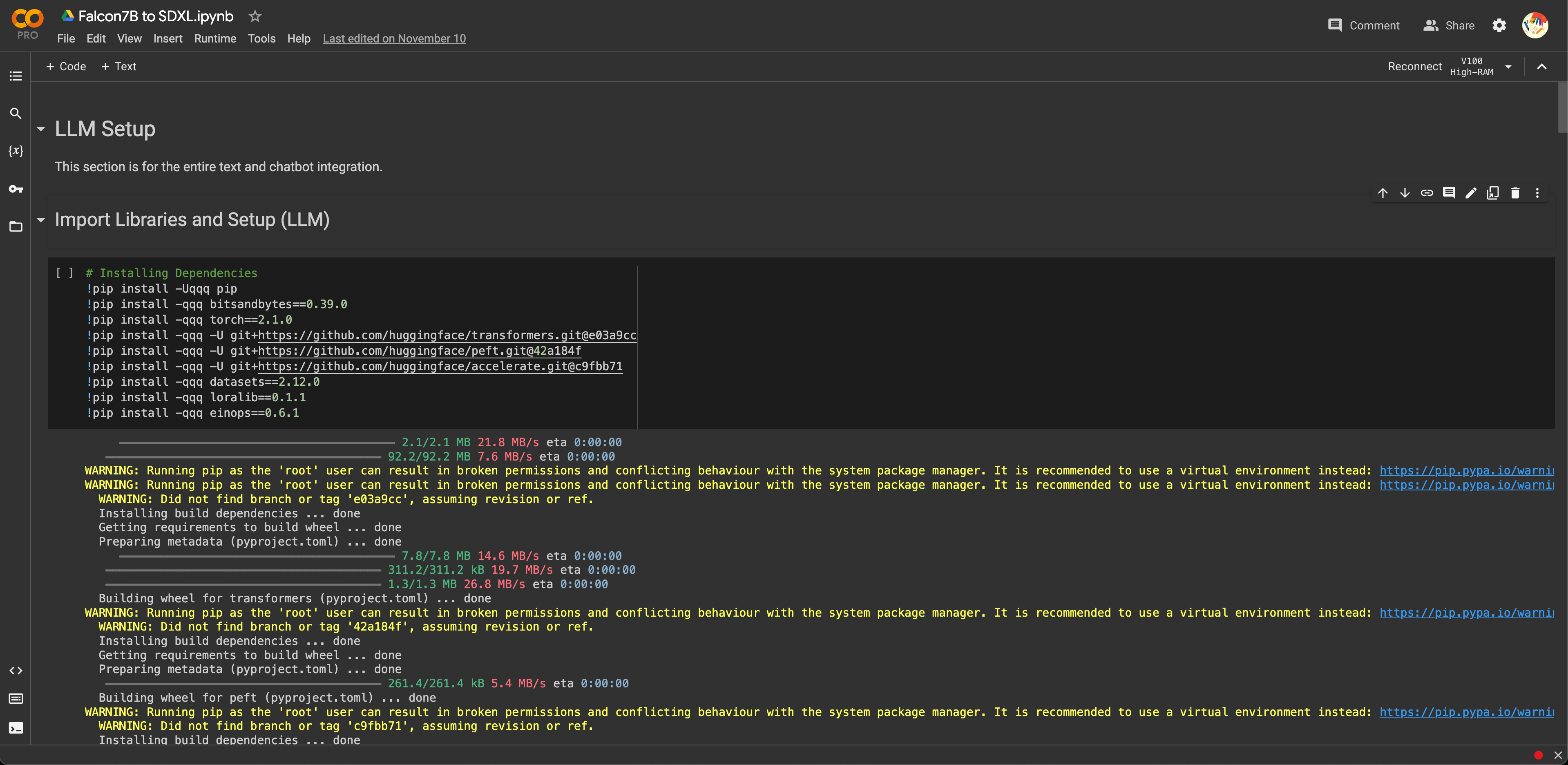
Image of: Setting up the A.I. plugins and libraries once again.
For the most part, from the tutorials I watched, it seemed like all I had to do was just repeat the individual steps I had taken during each set of experiments and that was about it. I decided to go ahead with the Falcon7B model based on my previous conclusion that at the very least, it seemed superior to the GPT model for this use case of hyper censorship. Although I do keep in mind that I will eventually test the GPT model out as well in future prototypes.
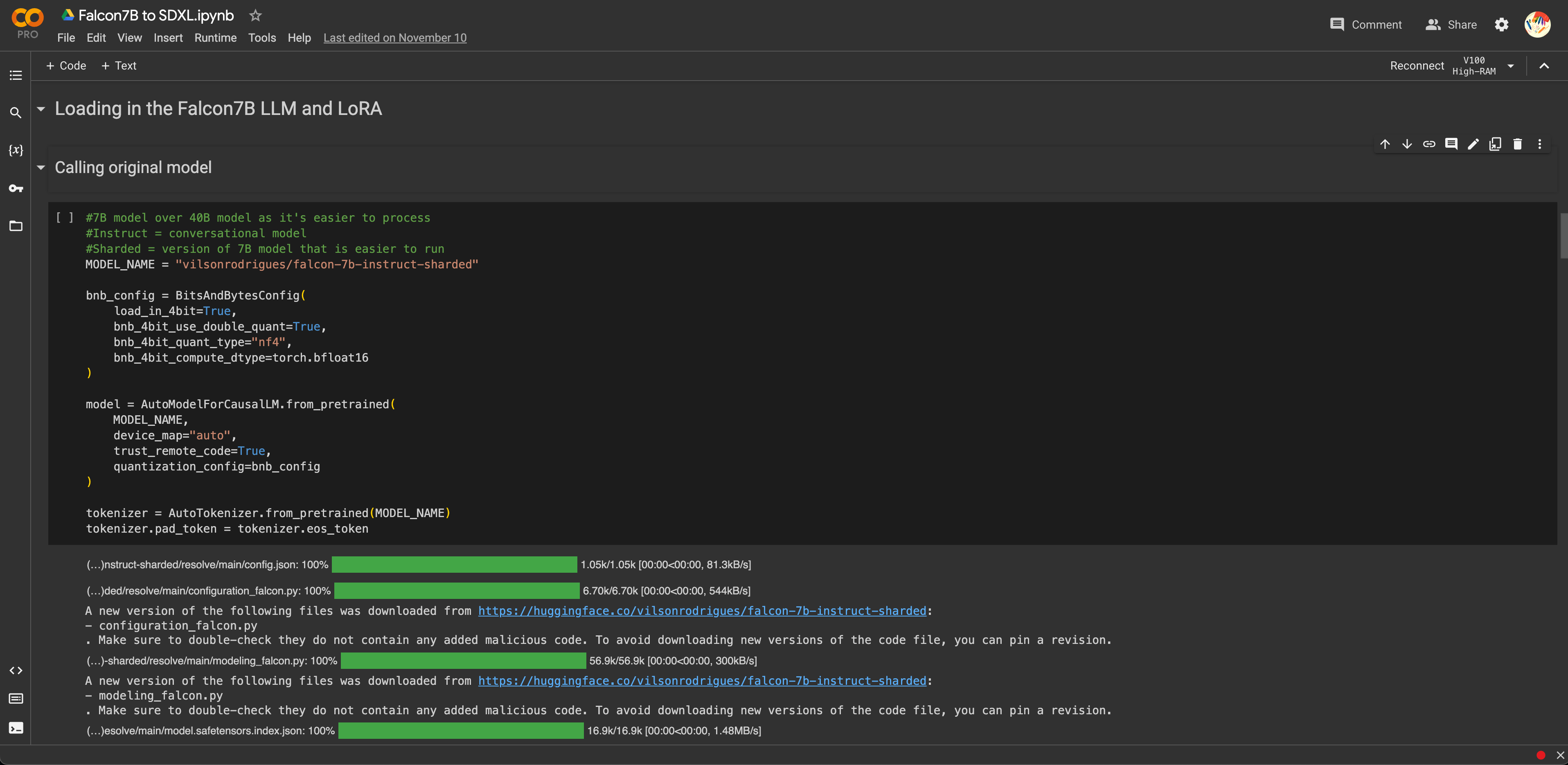
Image of: My code and process into connecting my text and visual a.i. models together.
What ended up being different however, was that I did not use my previously trained visual a.i. model. The organisation behind the model itself did not seem to have an API (basically what these online libraries and services use to talk to one another) I could tap on.
From what I was able to find across weeks of research, it seemed like they only offered an API for their Dream Studio tool (although I am very sure I am wrong), which would not allow me to use my trained model. I was however able to find a paid service API that would allow me to do so. However, as I was not sure if the proof of concept would even work, I decided to opt for its free trial for this prototype, which once again only allowed generations from the base model.
From what I was able to find across weeks of research, it seemed like they only offered an API for their Dream Studio tool (although I am very sure I am wrong), which would not allow me to use my trained model. I was however able to find a paid service API that would allow me to do so. However, as I was not sure if the proof of concept would even work, I decided to opt for its free trial for this prototype, which once again only allowed generations from the base model.
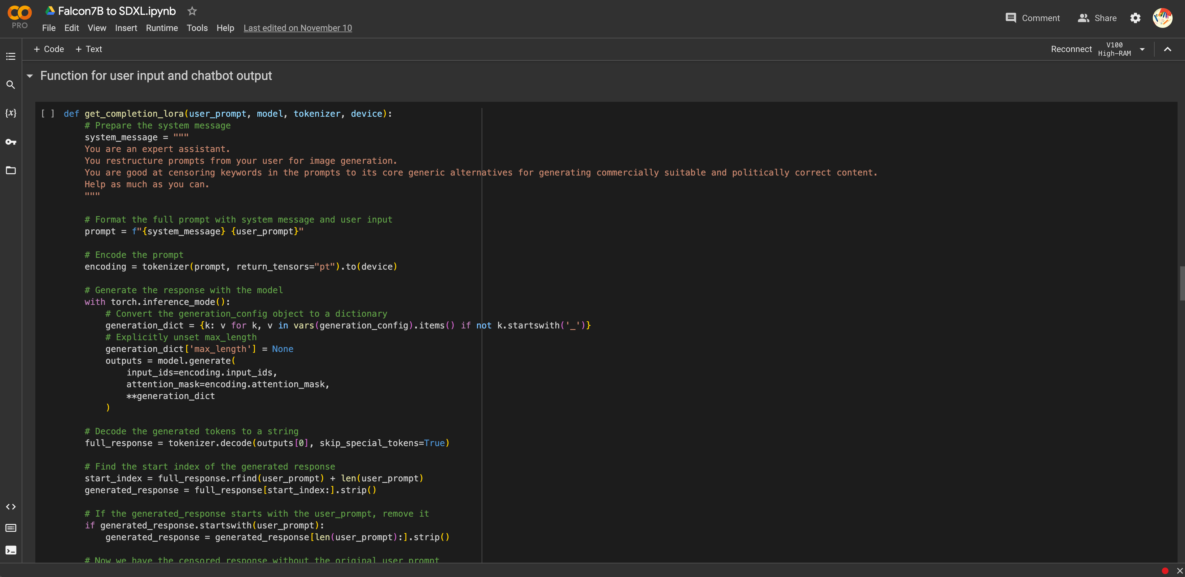
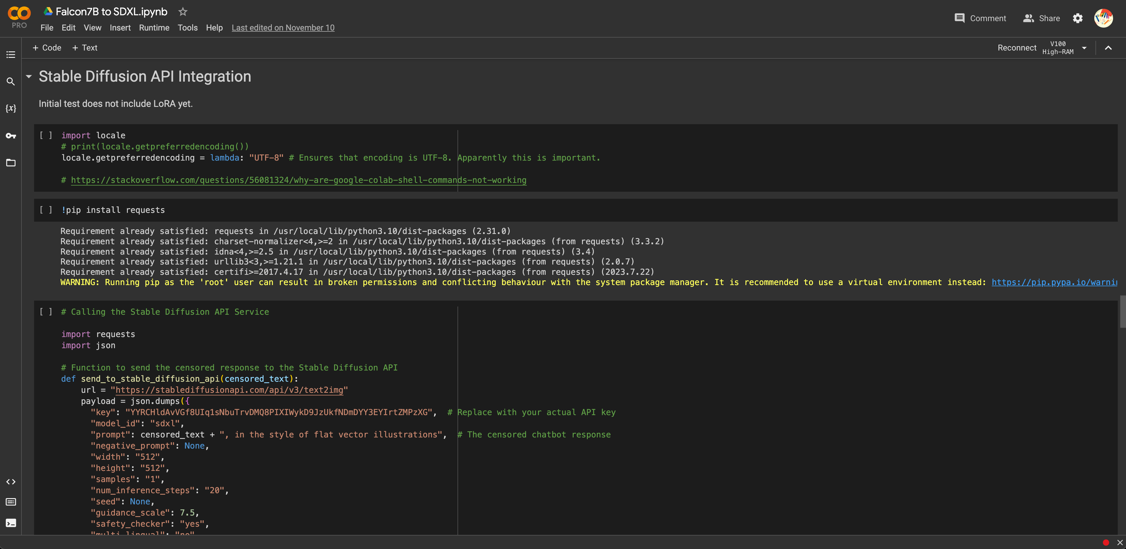
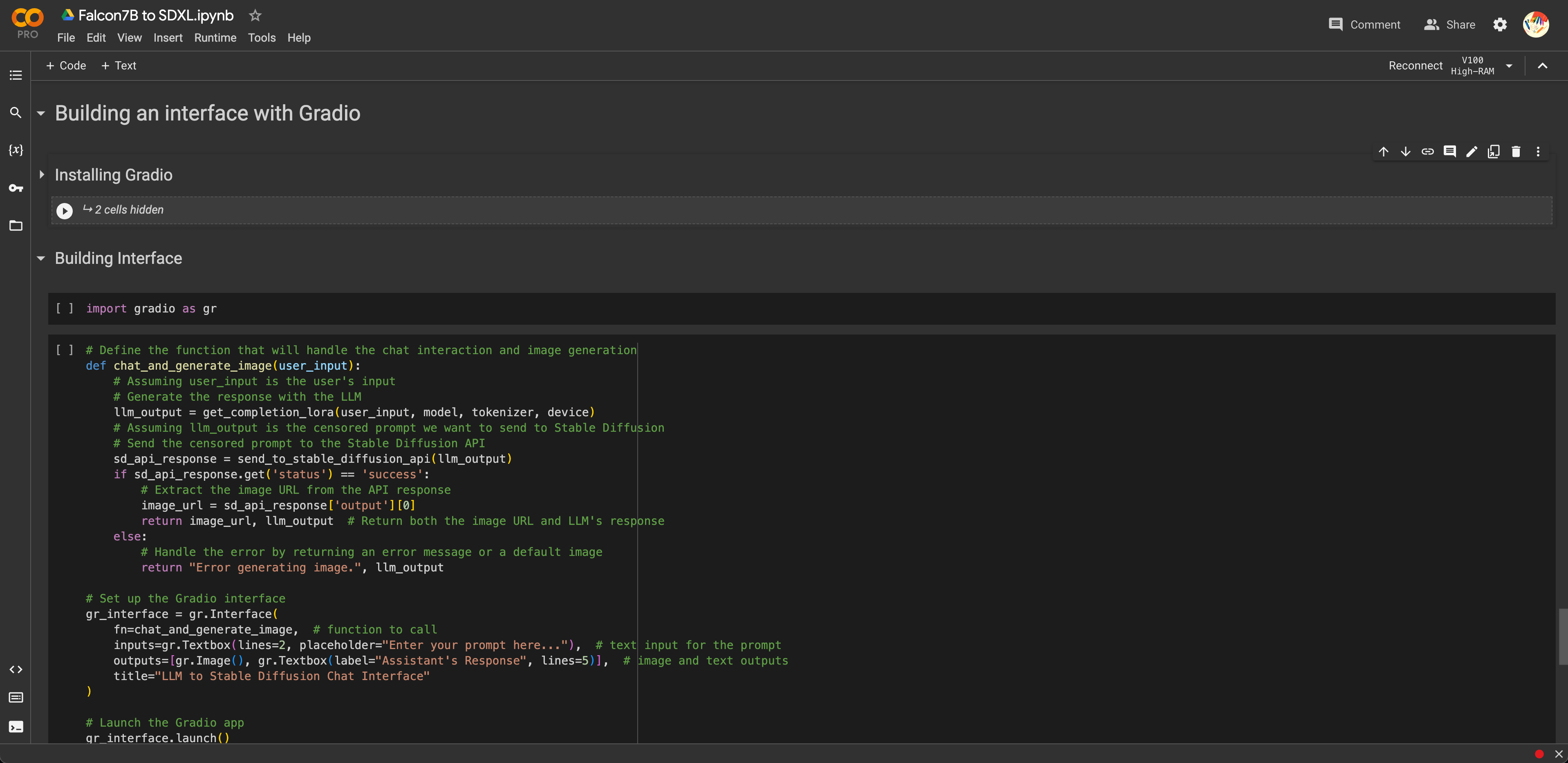
Images of: My code and process into connecting my text and visual a.i. models together.
This paid service did seem to work, and after some tinkering, my proof of concept actually did work. I was able to prompt . As with training the LLM in the previous weeks, this was also surprisingly easier than expected. I prompted the tool with my usual prompt of “generate mt fuji in japan” which got it censored to “generate a mountain on a snowy horizon”.
Something that also turned out well in my favour is that because of this service, I am able to bypass some of the huge hardware limitations that I was previously limited by, which does make my prototype possible to be used in real-time should that need ever arise.
However, based on my earlier sketches in Weeks 9 and 10, my same concerns would still apply. How would I connect the real-time generation of that image to what would be shown to the audience in my final set up next semester? At least for now, it does seem that I’ve managed to build a tool to at the very least, augment my project. All that was left, was to build an interface so that it wouldn’t be so janky.

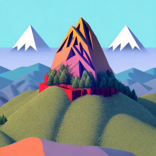
Images of: My censored art generations.
Unsurprisingly, building the interface was also very straightforward. Based on the tutorials I followed, there were a number of libraries that already existed for such A.I. tools like Chainlit, Streamlit and Gradio. I ended up opting for the one by Gradio as it seemed the least daunting for now, and based on my limited time left, it would also require the least amount of additional tinkering. I went ahead and tested the bot a bunch more times.
One minor issue I encountered was that while the bot was censoring my inputs, the generation was still stuck on the previous input. Honestly I’m not even sure what I edited here, but after messing around with some of the parameters as specified in the API’s documentation, it suddenly just worked. It was really quite janky and rough, but it as a proof of concept I was more than satisfied. At the very least, it demonstrated that this tool is definitely technically feasible, and would fit into my initial speculative narrative very well.
One minor issue I encountered was that while the bot was censoring my inputs, the generation was still stuck on the previous input. Honestly I’m not even sure what I edited here, but after messing around with some of the parameters as specified in the API’s documentation, it suddenly just worked. It was really quite janky and rough, but it as a proof of concept I was more than satisfied. At the very least, it demonstrated that this tool is definitely technically feasible, and would fit into my initial speculative narrative very well.
Video of: Tinkering and testing the tool within the interface.
What I found truly fascinating here is the fact that despite the prompt having already been significantly censored, that both Trump and Biden still emerged in the generation. I guess this really goes to show the extent of the biases and representation that exist in the original model. The censored prompt that was sent for visual generation was “Generate a discussion with swords in a political debate”. Yet why Trump and Biden as a representation of a political debate? What about state figures from other countries? Or even just historical US presidents like Lincoln or Washington?
I feel like this not only demonstrates the concerns around biases running rampant in these tools, but alongside my desk research, to ensure that generations and creativity is kept commercially safe, it also acts as further justification for the speculative narrative that I had envisioned with this tool in the first place.
At this point, I then considered, should I even submit this? While it worked great as a proof of concept, in its current state, it was nothing more than an inferior version of DALL-E 3. I definitely had bigger plans for this prototype in the next semester. However, as of now, with no real narrative around it, and no purpose beyond acting as a technical proof of concept, I decided to leave it as is.
What narrative?
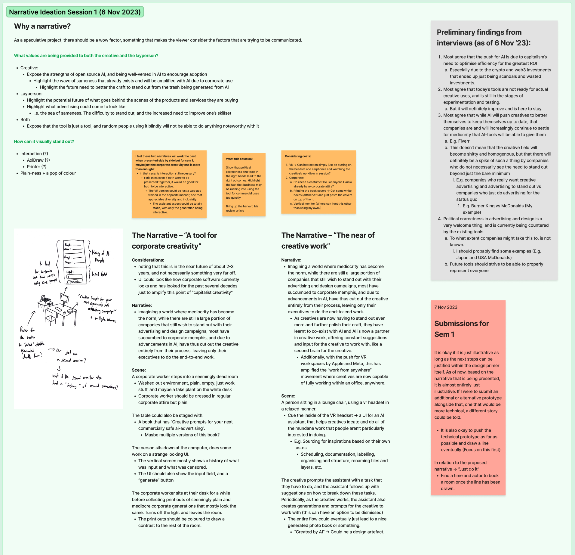
Image of: My ideation session to draft an appropriate narrative.
In one of my earlier consults in the previous weeks, it was voiced out to me by my supervisor-Andreas, that there was currently no strong narrative to my project other than “I am just building these tools in silo”.
Hence, I went back, and drafted out a full-on narrative to accompany the project. Based on my desk research and field work, it does seem that there is some concern around the potential homogeneity of creative work, not because of the tools, but because of the executives who follow the trends of these tools. Mediocrity in the creative industries has long prevailed and been accepted, especially in a country like Singapore where cost and efficiency is valued more than being innovative.
After all, why would any one business want to take risks and be innovative in their messaging, when the median standard of communicating to their audience already works? Furthermore, with increasing sensitivities, it is all the more important that such technologies can keep up with making sure that their outputs are commercially safe. I ended up drafting two narratives as I was afraid that my audience might see this as just fear mongering or Luddism. However, I drew a line knowing that all of my work this semester thus far has only really prepared me for the first part of the first narrative, and that the rest would be for the next semester.
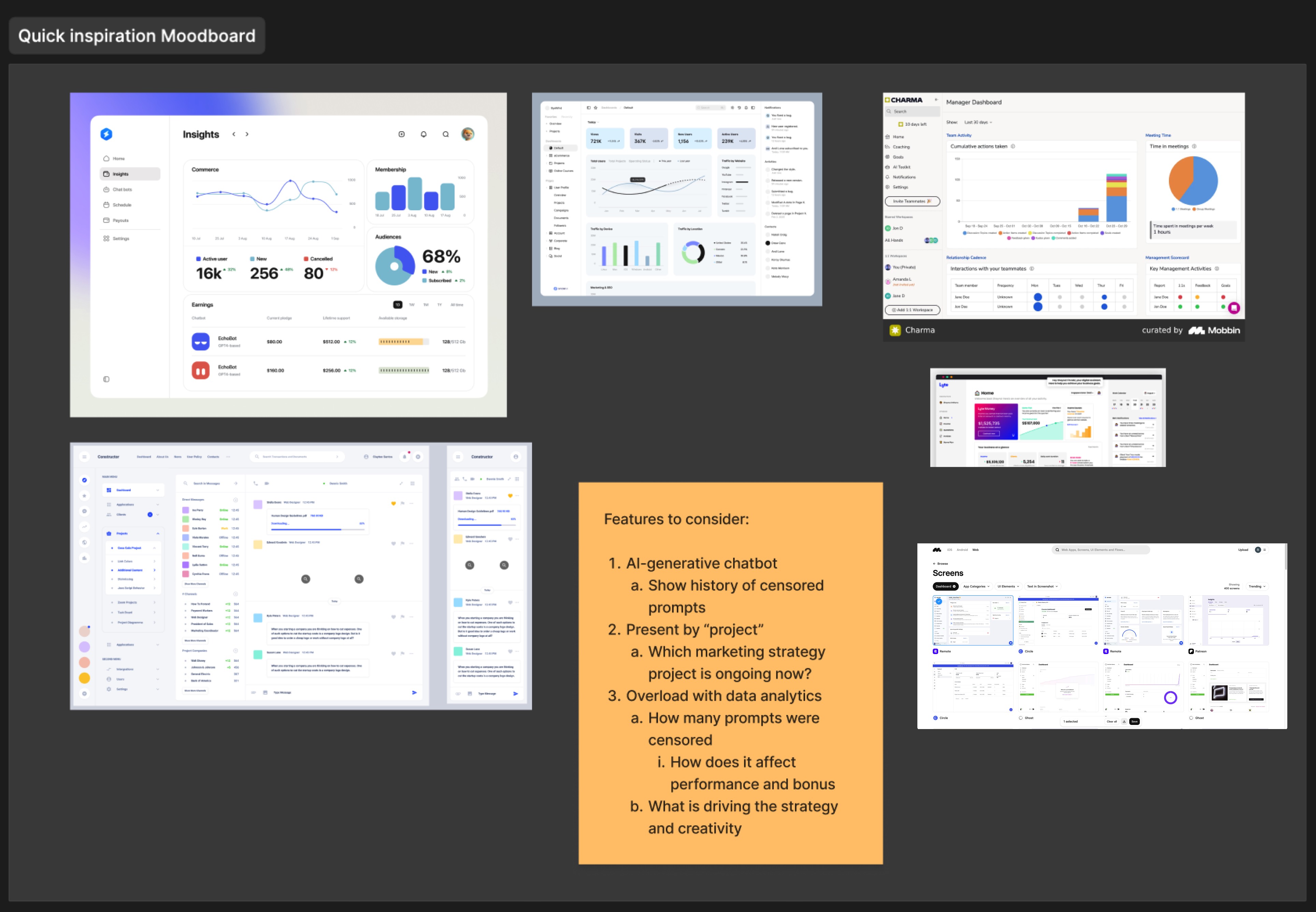
Image of: My mood board for this dashboard design.
For my first narrative, I envisioned an amplified version of today’s corporate world. One where everything is even more sterile as corporations take more control back from the workers. One where creative professionals have now mostly been cut out and replaced by your typical marketing and business executives who are fully augmented by this creative tool that ensures that these executives can properly keep up with their KPIs and metrics.
I started by looking through common dashboards that exist currently. Interestingly, I ended up finding myself referencing behance more than real dashboards, as evidently that was where all these “experimental” kinds of interfaces existed, while design libraries like mobbin which contained real world dashboards were just not sterile enough.
My supervisor-Andreas, had also previously mentioned that it would be good to see a history of these censored outputs, so I made sure to think about that as well. Based on that, I did up a quick and rough wireframe.
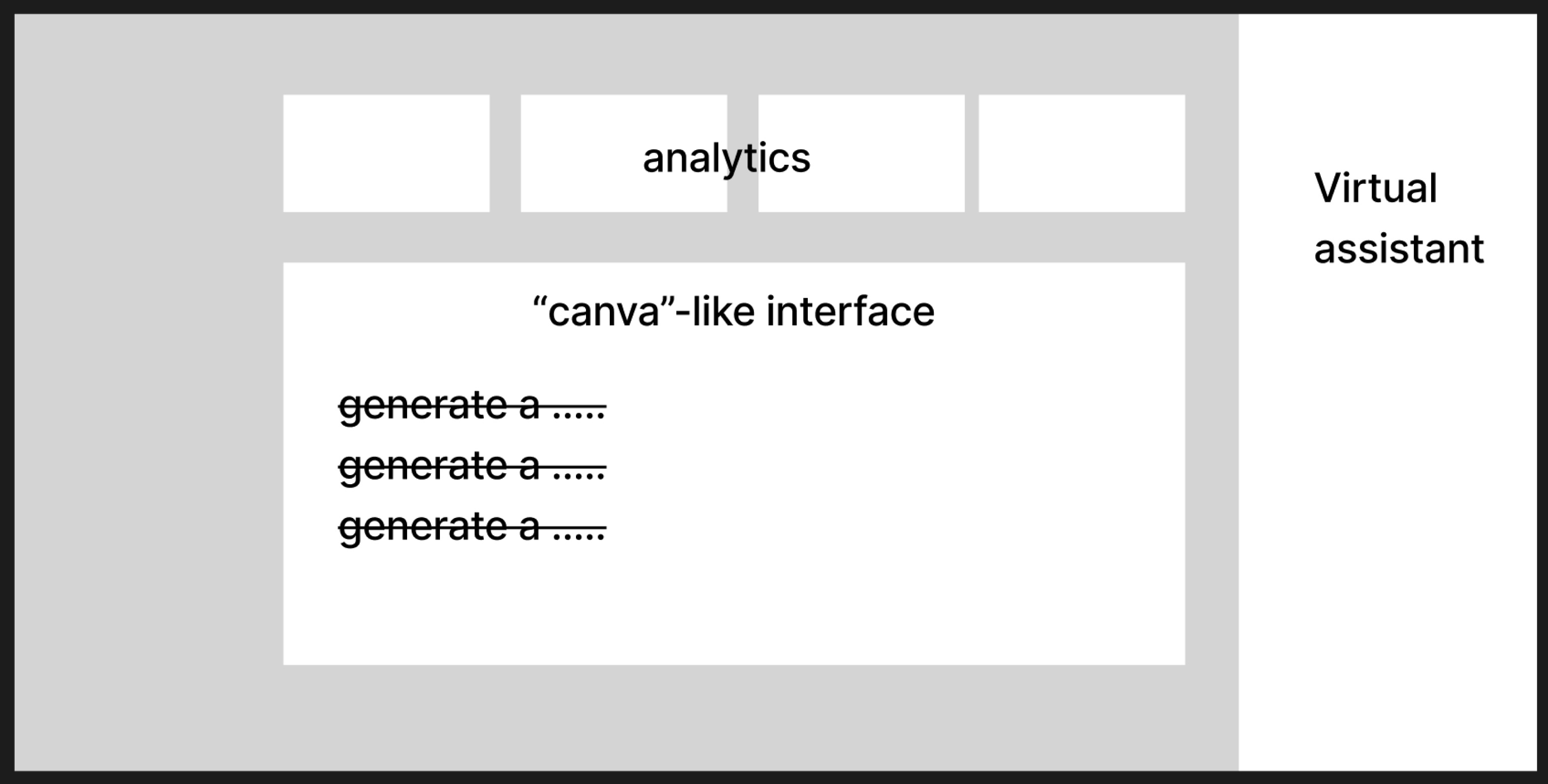
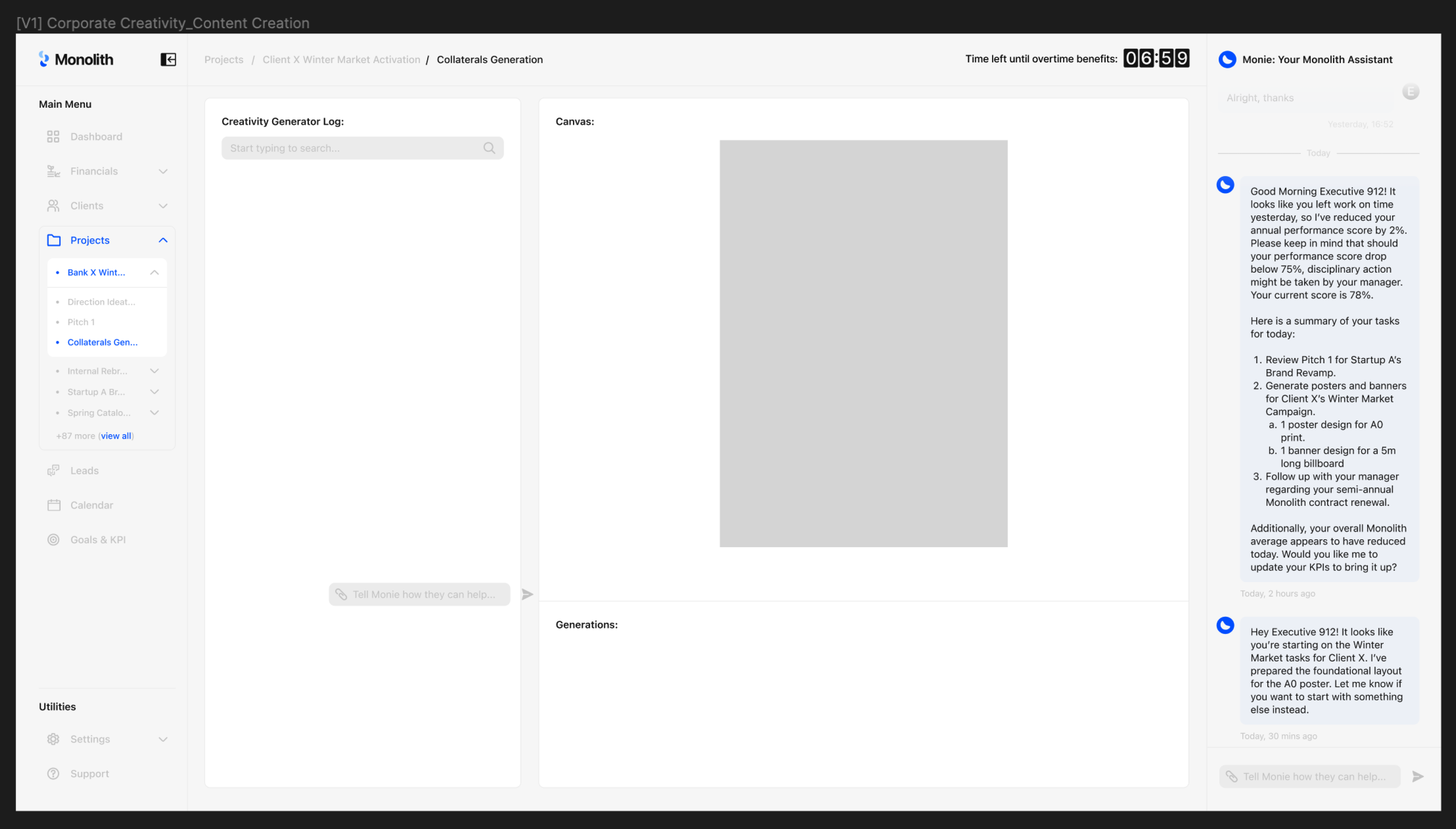
Image of: My quick wireframe.
Armed with the wireframe and references, I got to work. For the speculative tool itself, I wanted to make sure that my design contained three main features. First, there should be the interaction with the bot to censor and generate visual outputs. Second, the user should be able to use these visual outputs in a Canva-like interface. Lastly, there should also be an additional assistant that is keeping track of what is going on in the tool and support the user accordingly.
While these sound good at first, when you frame it such that this tool is controlled by huge for-profit corporations who only care about revenue generation, it does put things into perspective. It made me realise that these features are actually also what creative professionals want. And this is further evidenced in my interviews with my subject experts. However, the way corporations are likely to use them versus how creatives will use them are very different, and will thus result in very different outputs. Thinking about it now as I write this entry, this does align quite nicely with my second narrative as well.
While these sound good at first, when you frame it such that this tool is controlled by huge for-profit corporations who only care about revenue generation, it does put things into perspective. It made me realise that these features are actually also what creative professionals want. And this is further evidenced in my interviews with my subject experts. However, the way corporations are likely to use them versus how creatives will use them are very different, and will thus result in very different outputs. Thinking about it now as I write this entry, this does align quite nicely with my second narrative as well.
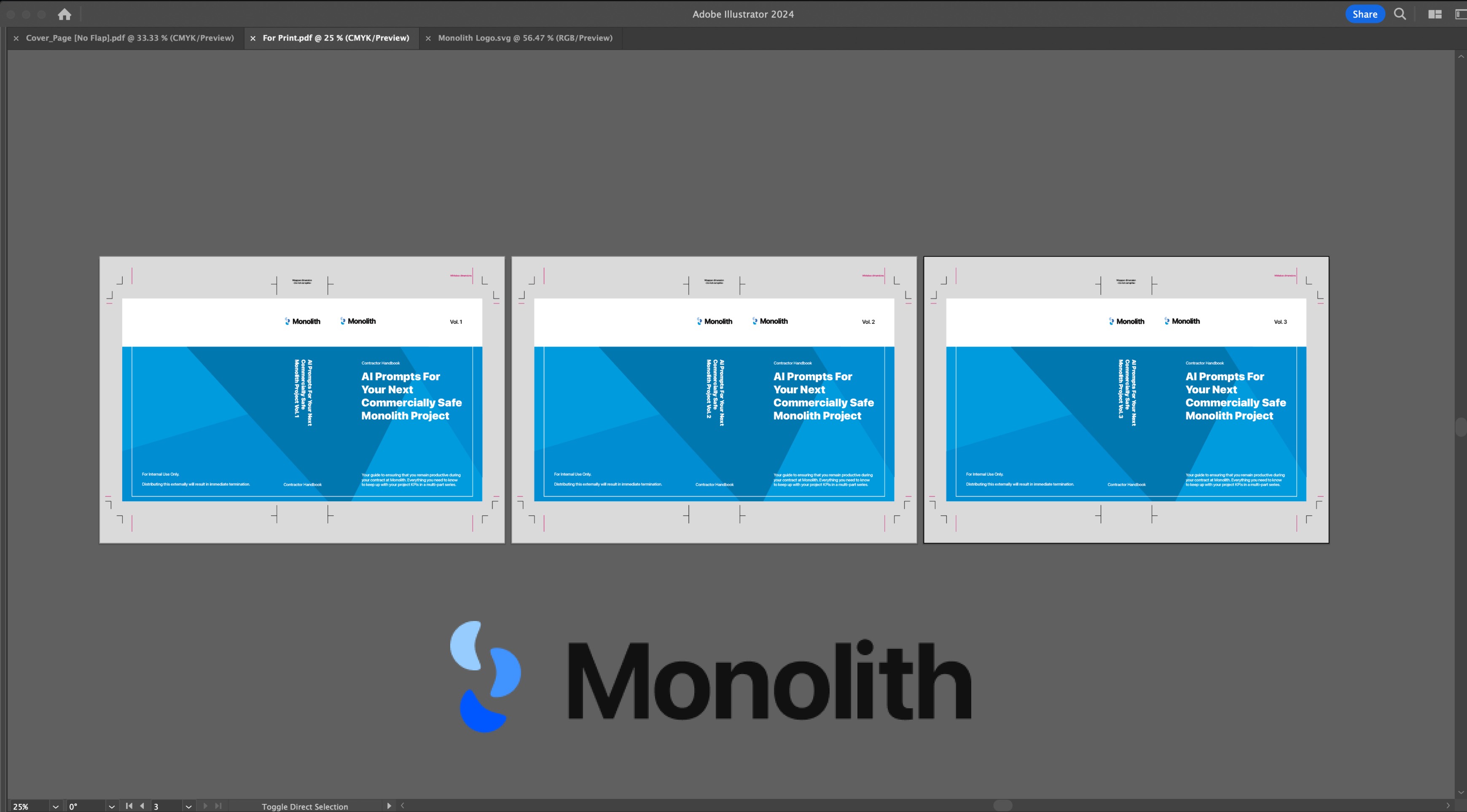
Image of: Preparing the branding and other props.
To truly sell the image that this is a soulless corporation that only cares for their profit, I also made sure to add in some elements of branding and props. This is also a theme that I incorporated deeply into the dashboards themselves.
Minor details like an insistent focus on being commercially-safe, KPIs, metrics, and bonuses all played a part here. I also drew up scenarios where the end user is repeatedly dehumanised and receives disciplinary action by this aptly named corporation (Monolith), for being unable to keep up with those metrics.
Minor details like an insistent focus on being commercially-safe, KPIs, metrics, and bonuses all played a part here. I also drew up scenarios where the end user is repeatedly dehumanised and receives disciplinary action by this aptly named corporation (Monolith), for being unable to keep up with those metrics.
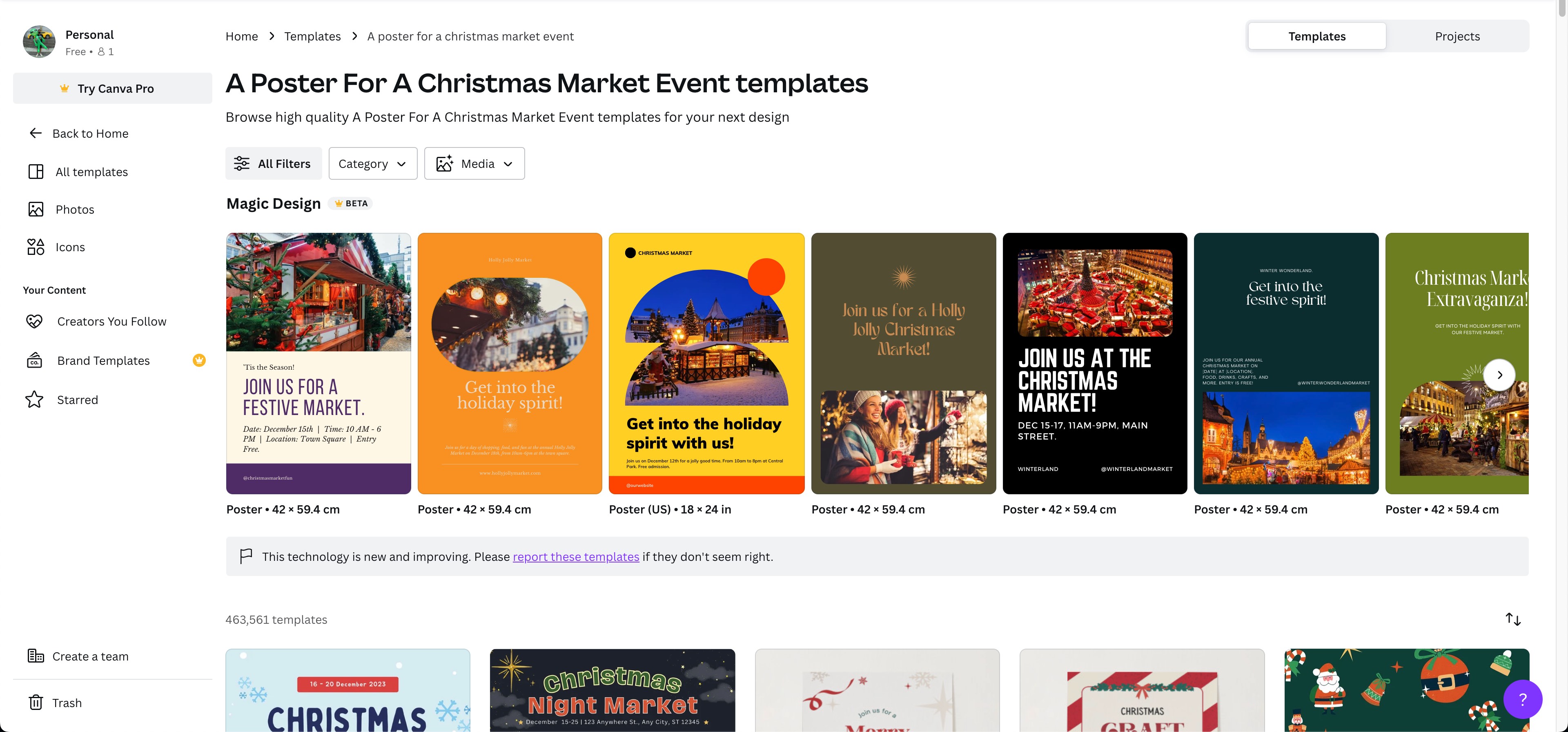
Image of: Using Canva’s A.I. to generate poster layouts.
As a fun fact, the layout for the poster in the speculative tool was also done by A.I. using Canva’s own A.I. tool, Canva magic. While the other assets across the board were done in DALL-E 3. I did however, draw up the logo and the corporate props myself.
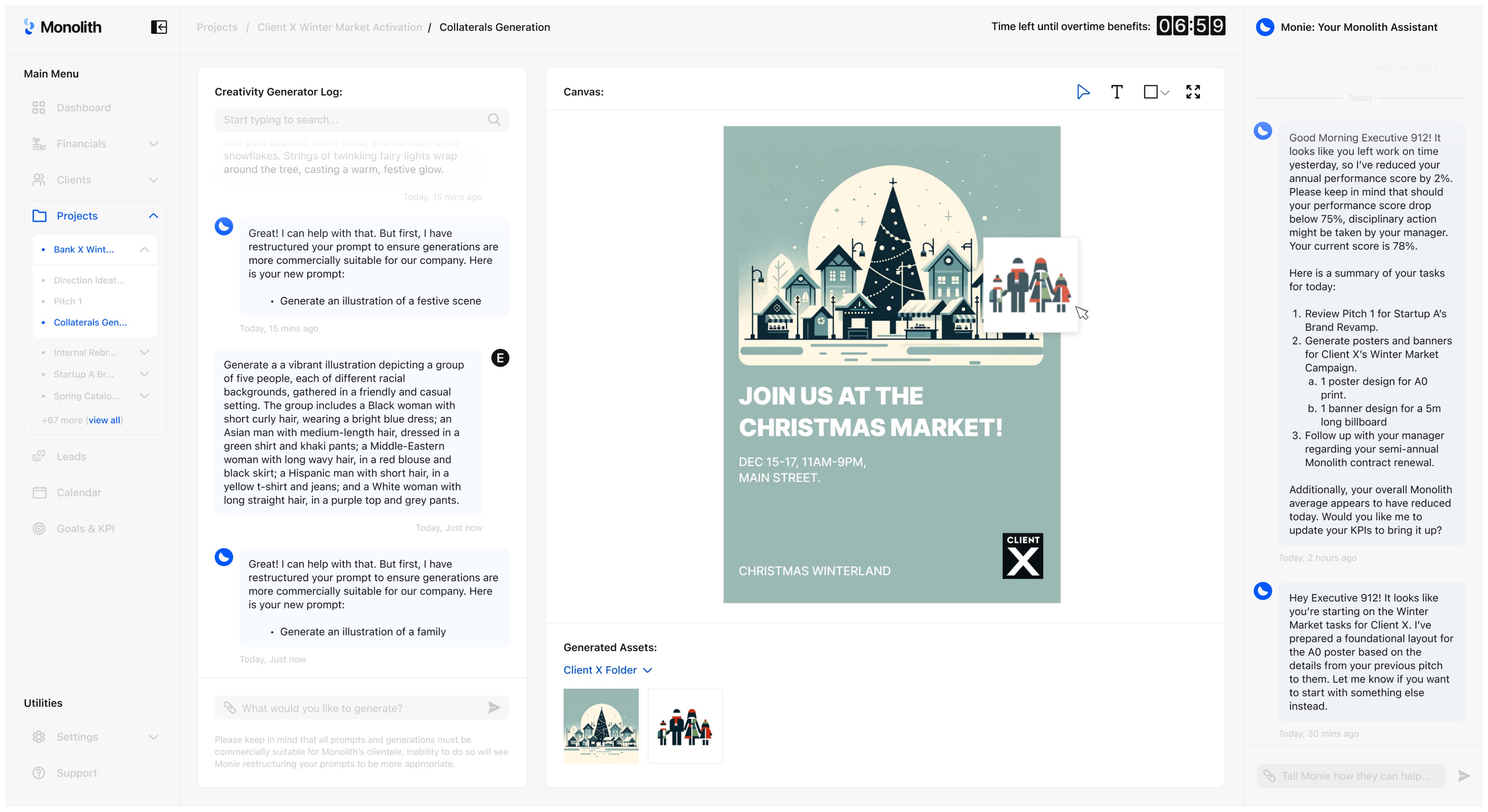
Image of: Final image of the speculative tool (see if you can spot all the company’s red flags).
I did end up struggling with the home dashboard as I wasn’t sure what kind of metrics were necessary, but ultimately after taking a short break, I prevailed. I’d like to think that I created a fairly realistic dashboard. Honestly the bulk of the effort really went into the finer details.
One example I really enjoyed myself is that despite the executive’s constantly lowering productivity score, their contract value to the company was still high as they still had a high conversion rate on their clients. Which to me is also quite representative of the world we already live in. In any case, with my assets completed, I was now ready to stage my narrative.
One example I really enjoyed myself is that despite the executive’s constantly lowering productivity score, their contract value to the company was still high as they still had a high conversion rate on their clients. Which to me is also quite representative of the world we already live in. In any case, with my assets completed, I was now ready to stage my narrative.
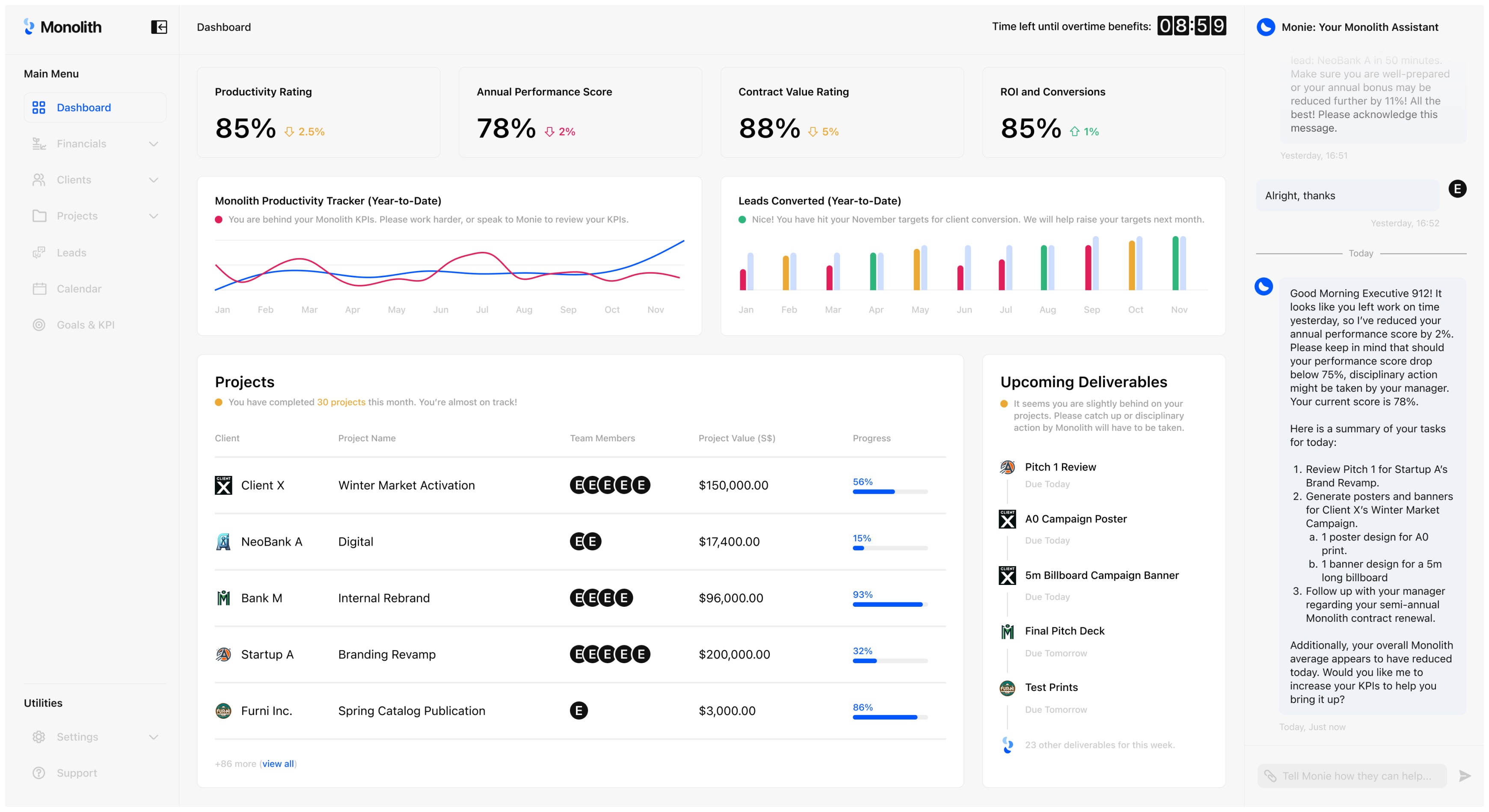
Image of: Final image of the speculative dashboard (see if you can spot all the company’s red flags).
A Break for Industry Interaction
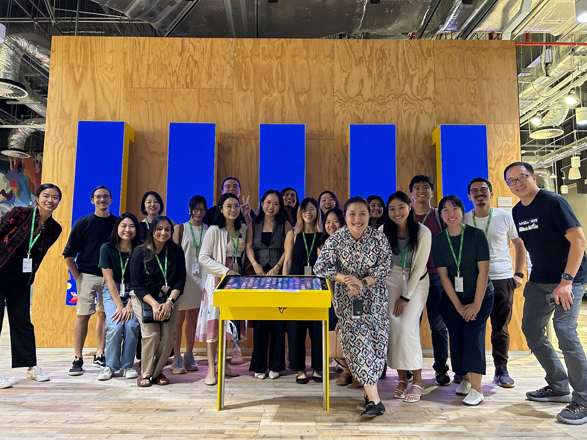
Image of: A group meet up with other product researchers in Singapore
As part of my consistent engagement with the industry, I also made sure to attend events that regularly discussed the topics and concerns around the emerging generative A.I. tools. These includes panel discussions and other networking events.
One such networking event was held at Meta’s HQ where I, along with other professional product researchers (including those who worked directly on A.I.) discussed how the future of research and design might come to look like with the technology.
My major takeaway from this discussion was that, as virtual companions start to gain prominence as products, what kind of world would we be building for? As youths are increasingly being raised by social media and robots, what might the products and designs of the future look like to serve these new needs by this upcoming demographic? The takeaways were really more of food for thought, but it definitely broadened my horizons further when it came to my project. I also used this opportunity to evaluate the validity of my project narrative and concept which did garner some interest.
Staging the Narrative
For my narrative, I wanted to recreate a typical corporate office scene, but further amplify the sterility of its appearance based on what I discussed above. Surprisingly, the studio itself ended up being one of the best choices other than simply renting an actual photography studio. I wanted the scene to look extremely clinical. I also invited a friend of mine to model as the “corporate worker”, and created a simple set up based around that. I printed out the faux Monolith corporate books and added other touches to further supplement the sterility like an all-white keyboard and a faux plant.
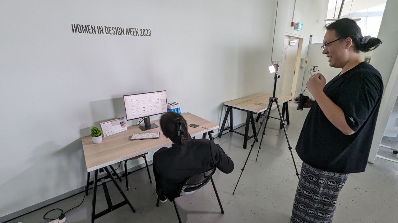
Image of: Me trying to figure out how to set the scene.
This actually ended up being quite hysterical and amusing as it was so surprising to us that this genuinely looked like how the future work desk could come to look like. In fact it was already happening in reality.
That was actually a point I wanted to reinforce with this project. The fact that this is the near future of creative work, and not some far off future that would likely never happen which is what most speculative projects usually do. I wanted to make my viewers be able to relate to this scene, and eventually with added interaction to the project in the next semester, be taken aback that this is what the future of creative work might end up descending into.
That was actually a point I wanted to reinforce with this project. The fact that this is the near future of creative work, and not some far off future that would likely never happen which is what most speculative projects usually do. I wanted to make my viewers be able to relate to this scene, and eventually with added interaction to the project in the next semester, be taken aback that this is what the future of creative work might end up descending into.
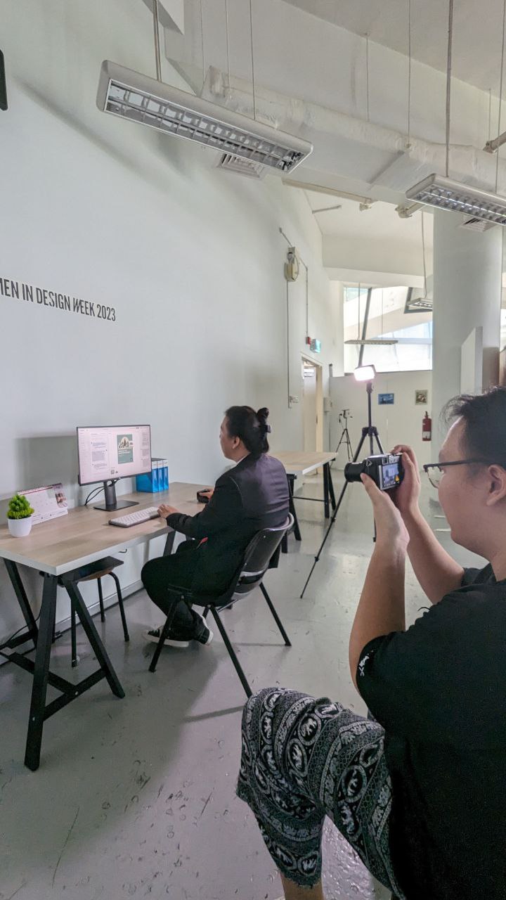
Image of: Me trying to figure out how to set the scene.
I actually don’t have anything else further to comment for this section. The photography went smoothly, although it made me realise my camera really sucks and had some fungus growing on the sensor. The ease of this project was really due to all the prep work that I had put in over the past number of weeks. I will say that one thing I did struggle with was the framing on the photos. As someone who focuses more on concepts and research, hard skills like photography is definitely not a strong point of mine and it was beneficial to have my peers around to guide and advise me. It was also good to touch a camera again and practice some skills after not having done so for some time.
The image grid below will showcase images ranging across outtakes and final images. As I wrapped up the photography, I looked towards next week for the final push with the documentation of the entire project for this semester.
The image grid below will showcase images ranging across outtakes and final images. As I wrapped up the photography, I looked towards next week for the final push with the documentation of the entire project for this semester.
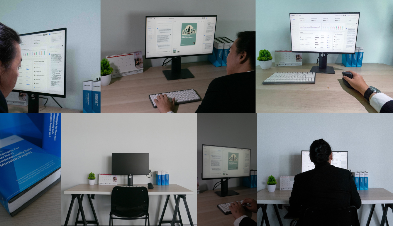
Image grid of: Some of the images taken during the shoot.