SEMESTER 1 Week 15
Documentation And Learnings
Painting a Story
It has been my intention all along to host my project itself as the landing page of my entire project’s website. Where the other documentation would also be hosted on. To accomplish this, I’ve been collecting references to ensure that I can properly communicate the story behind the images that I will present. Especially since I personally feel the concept is significantly weaker right now without the interactivity aspect that I had planned for the next phase.
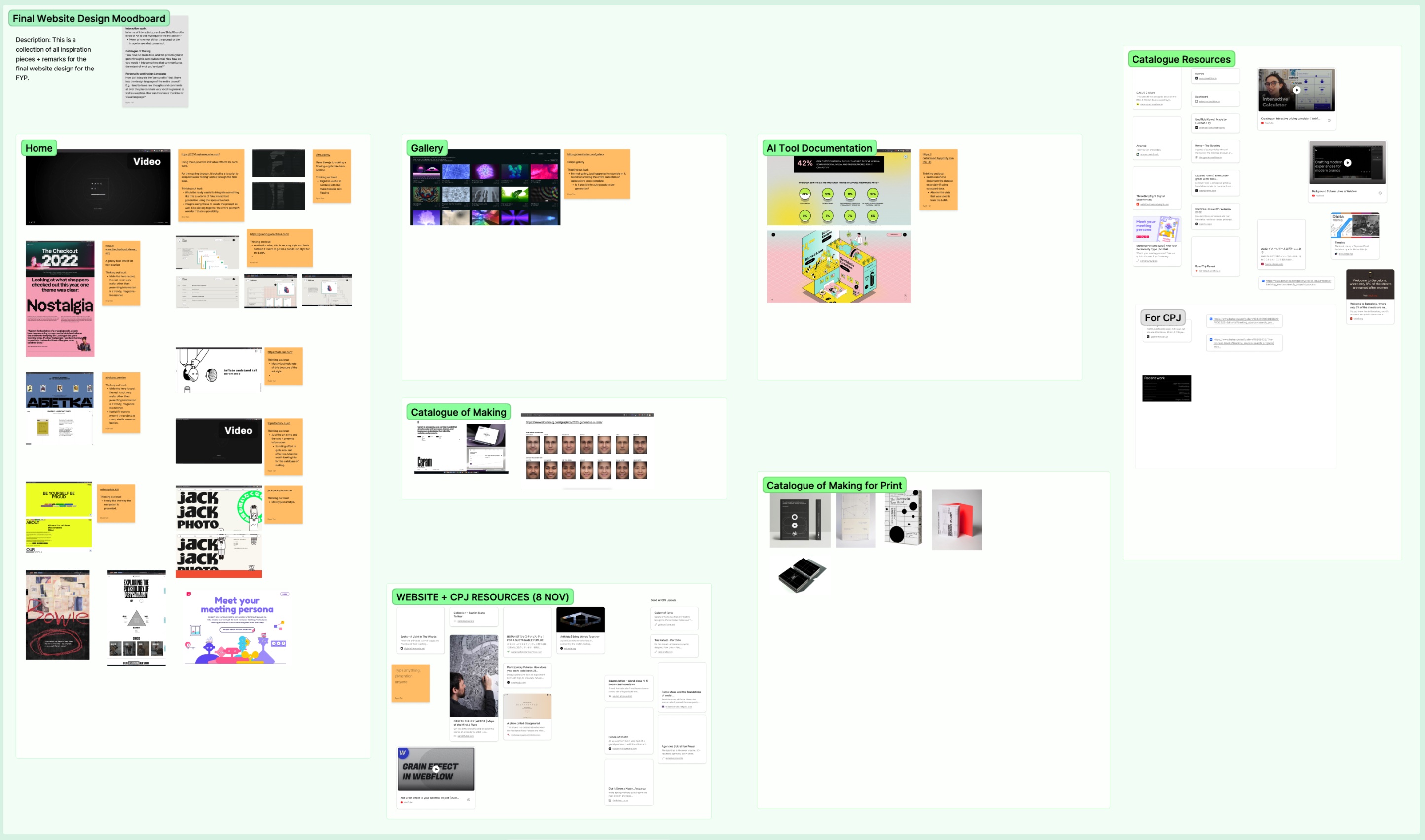
Image of: My growing mood board of references for the entire website.
One of my core considerations was just how much text did this narrative require? I knew quite well that the average viewer would not read through the bulk of it, hence I had to ensure that the text that needed to be read had significantly more prominence than the rest of the copy. That said, I eventually decided to go with lengthier copy as I was inspired by the work of Studio Kontinentalist. They are a data visualisation studio who regularly publish articles that visualise data in a way that utilises heavy amounts of story telling.
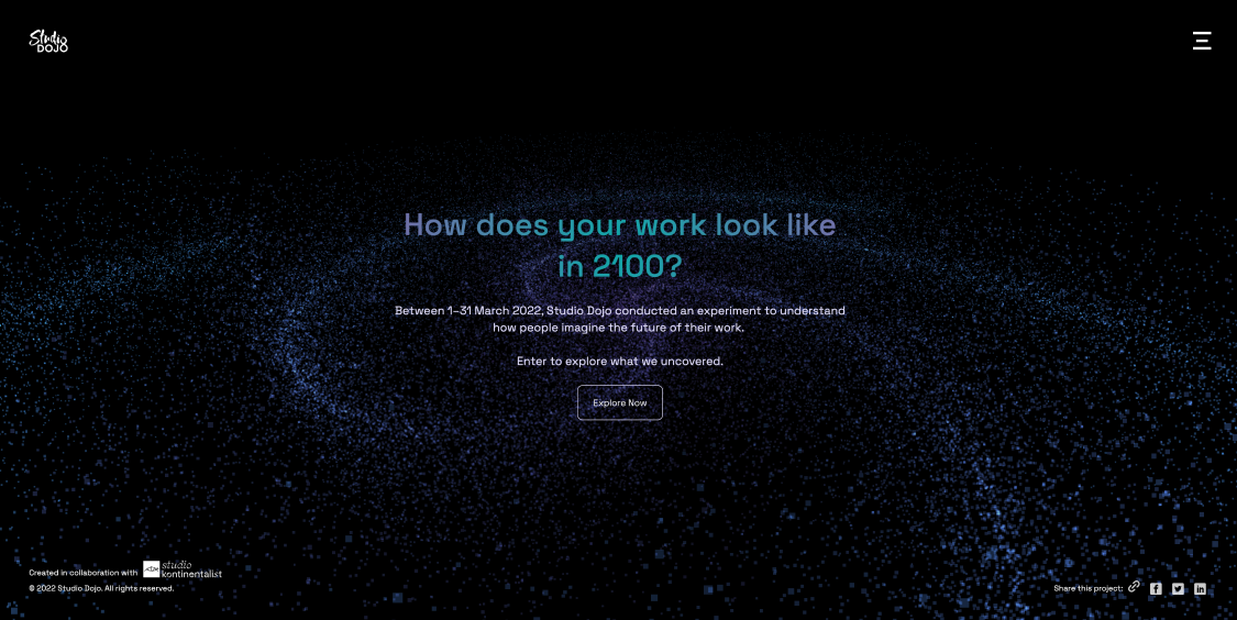
Image of: Participatory Futures Landing Page
Two of their works that I drew heavy inspiration from are the “Participatory Futures” and “A place called disappeared” projects. I thought to myself, if they could do that to supplement their data visuals, why couldn’t mine be like that too?
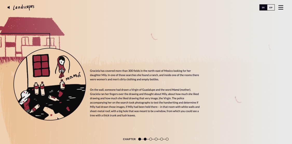
Image of: A snippet from “A place called disappeared”
I began with designing the layout with placeholder images, just trying to piece things together. I then marked out which spots were the most suitable for which image, and filled them in accordingly. This was relatively simple enough as I took a lot of references from my previous iteration of the catalogue of making that I had worked on between weeks 9 and 10.
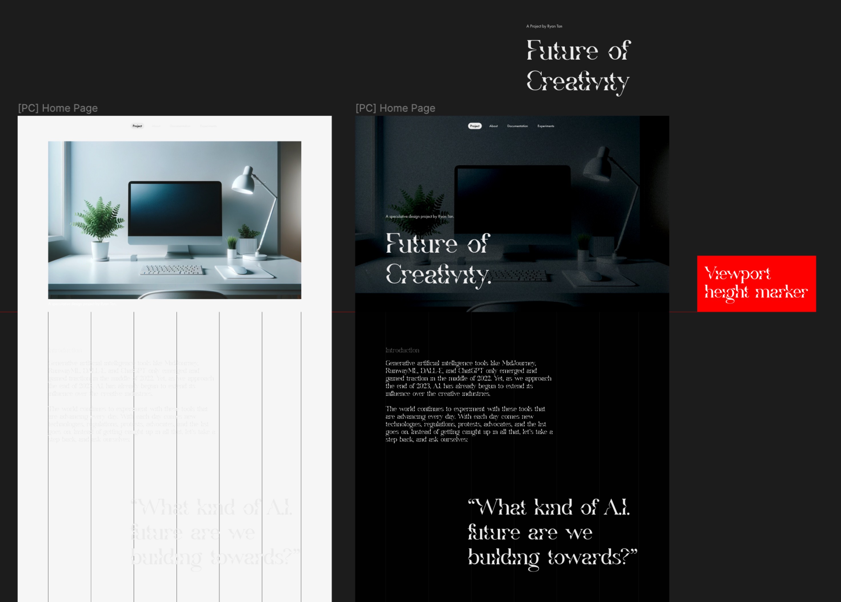
Image of: Figuring out how to design this layout.
I did have one concern here though. One of the reasons I felt that the projects by Studio Kontinentalist did so well, was due to their use of fancy animations and graphics. While acknowledging that they have literal teams of people and multiples of the amount of time as compared to me, it did seem that ultimately my project was going to be inferior in terms of communication and presentation. Honestly at this point, as it neared submission, there isn’t much I can really do about it. So I just pushed on with what I had.
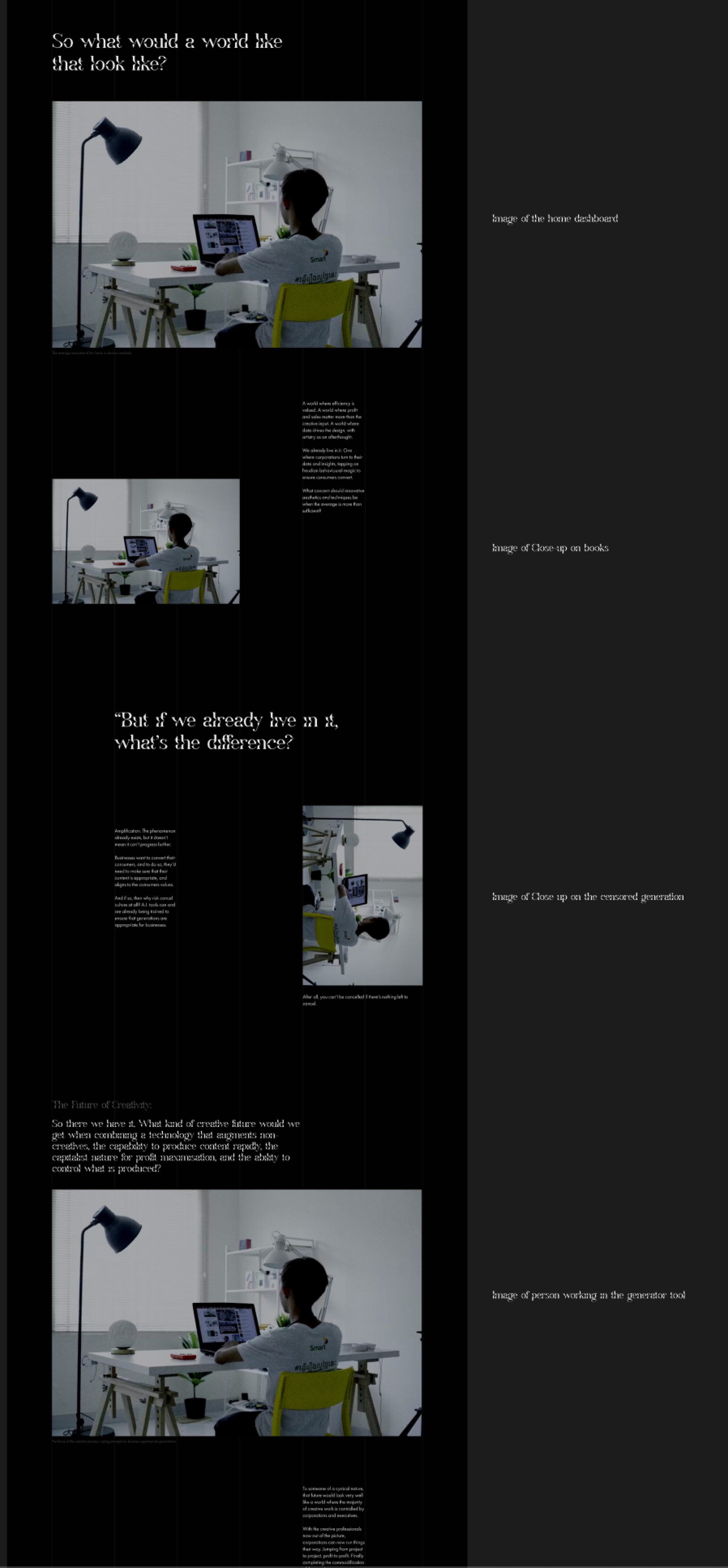
Image of: Planning the narrative and the layout
Building this in Webflow actually ended up being a lot simpler than expected. By now, I had already constructed the bulk of my CPJ and this website in Webflow so I was quite used to it. In fact I’d say that I was getting better each time I entered the tool.
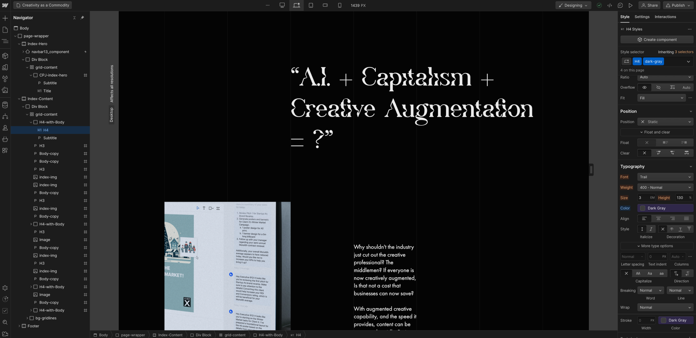
Image of: Building the Project’s Page in Webflow.
Where the major trouble came however, was making the page responsive. I realised that based on the way I laid out every single page of this website (as I was leaving responsiveness to the end), that it would be near impossible to scale down the pages properly. If I tried, the entire page’s text layout would just break.

Image of: All the text layouts completely breaking on a smaller scale
After some trial and error, I eventually found a very rough method of doing so, but it ended up being quite hard-coded. I’d say it was just kinda a happy accident and the fact that the page’s length was on the shorter side, that it even ended up being able to scale down. You can view the completed page by just clicking on index in the navigation menu.
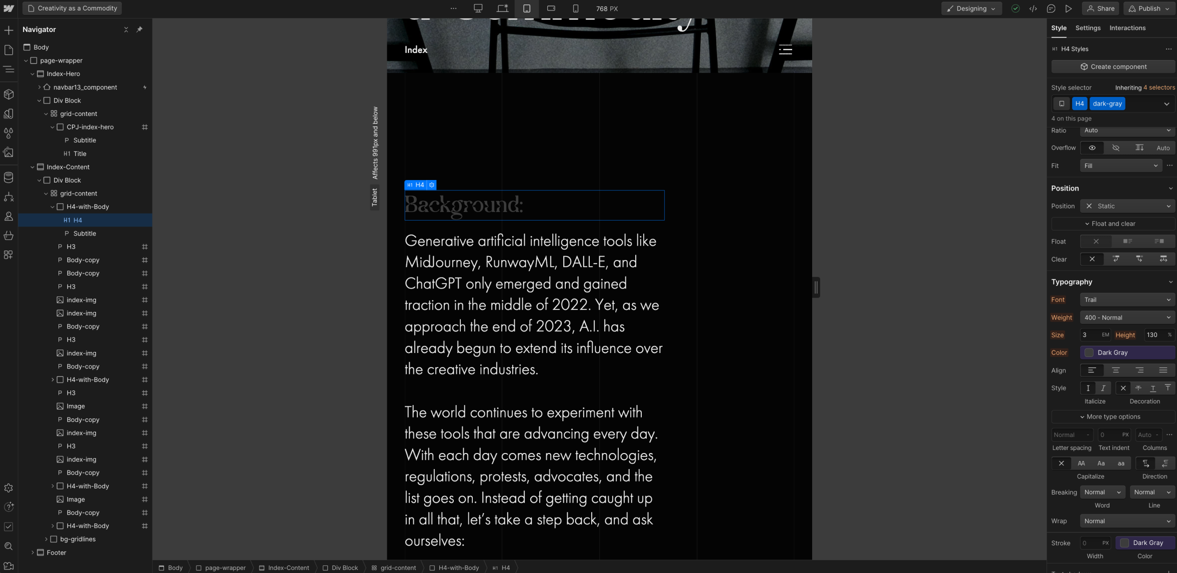
Image of: Fixing the scaling issues in Webflow.
Redoing the Catalogue
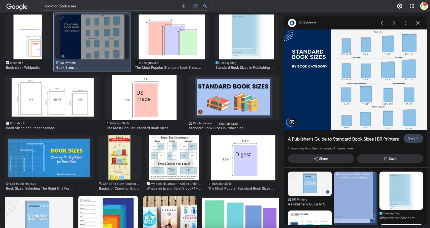
Image of: Trying to figure out what is a good book size.
As mentioned, the way I had been doing my web layout was entirely wrong. This meant that my catalogue would not be able to scale below anything beyond the original designed breakpoint. Even on larger screens it looked completely broken. Animations weren’t working out either.
Hence, rather than redo the entire thing on web again, I decided to opt for a pdf publication instead. Over the past few weeks, my supervisor-Andreas has been encouraging me to draft a publication when as this project comes to its end next semester. I’ve been scratching my head thinking about what could possible be in this publication that wasn’t already in my original catalogue of making. Seeing as I was now doing a pdf for the catalogue, I thought, why not just combine the both? With this approach in mind, I began drafting the new catalogue of making.
Hence, rather than redo the entire thing on web again, I decided to opt for a pdf publication instead. Over the past few weeks, my supervisor-Andreas has been encouraging me to draft a publication when as this project comes to its end next semester. I’ve been scratching my head thinking about what could possible be in this publication that wasn’t already in my original catalogue of making. Seeing as I was now doing a pdf for the catalogue, I thought, why not just combine the both? With this approach in mind, I began drafting the new catalogue of making.
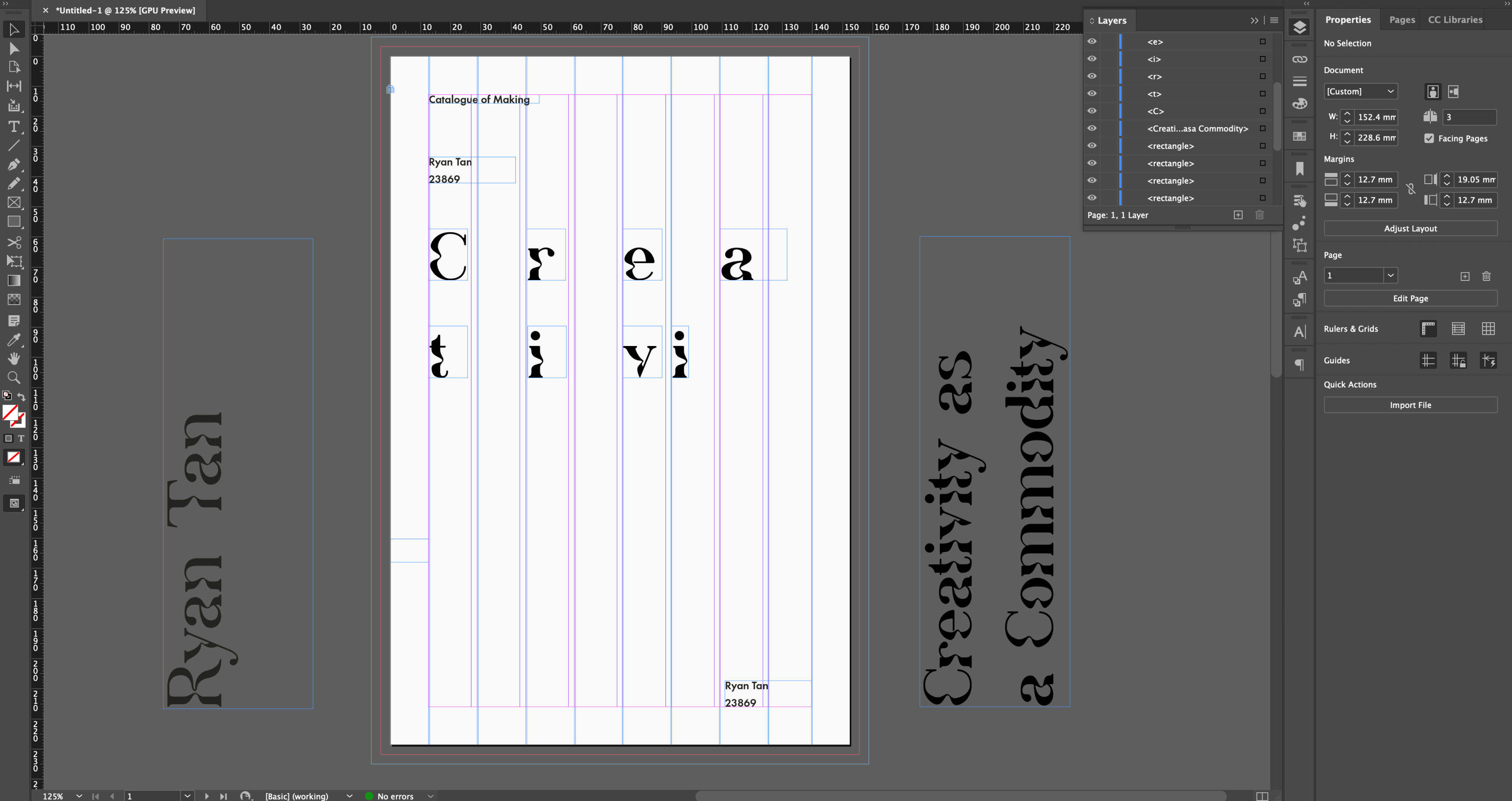
Image of: Trying out different layouts for the catalogue’s cover.
As mentioned in the previous entry, my hard skills are not exactly that good. Much less so for anything print-related. While I had no intention of printing the catalogue now, I definitely did want to print it when I fully complete it next semester. Hence, I started off by looking through various book sizes and inspirations, trying to figure out how to even start with the cover.
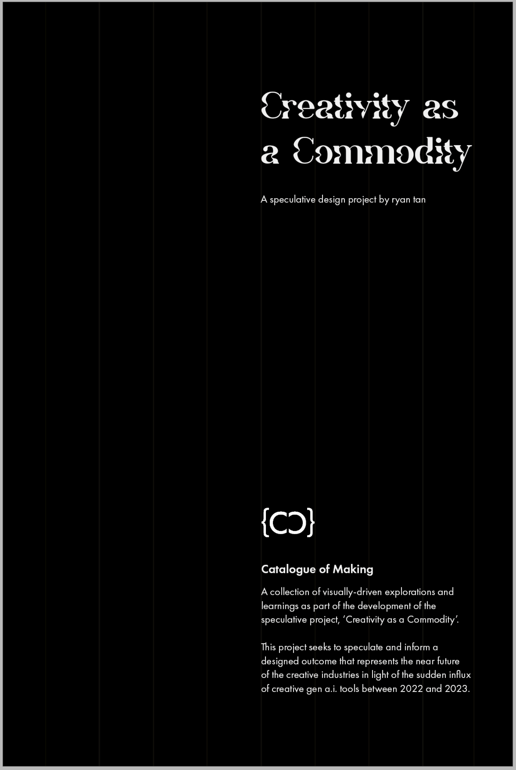
Image of: My final cover page for my catalogue.
One consideration I was designing with was, how would I make sure that there is a consistent visual language across the catalogue, and my other work? I think this made it significantly harder to design the catalogue. Especially with the grid-like pattern I incorporated into every part of the project.
Eventually I did manage to create a cover, one that I felt suited the aesthetic of my project quite well. What I found really helpful was to refer back to a past project where we had previously collected a number of images of well-designed art books that I could now use for referencing.
Eventually I did manage to create a cover, one that I felt suited the aesthetic of my project quite well. What I found really helpful was to refer back to a past project where we had previously collected a number of images of well-designed art books that I could now use for referencing.
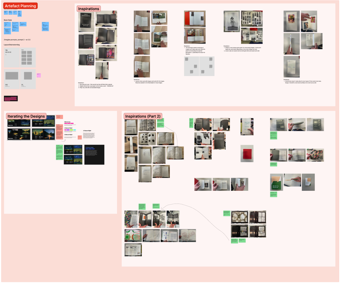
Image of: My past references for books.
Most of the catalogue was also quite straightforward as the layouts and content had already been planned in the previous iteration, so it was really more about just quickly adapting it to be suitable for “print”.
I was, however, annoyed that there was a lot of sunken cost for the web version of the catalogue, but honestly, moving forward, I do feel this is the more appropriate version of the catalogue, rather than one that is mostly just fluff with fancy animations.
I was, however, annoyed that there was a lot of sunken cost for the web version of the catalogue, but honestly, moving forward, I do feel this is the more appropriate version of the catalogue, rather than one that is mostly just fluff with fancy animations.
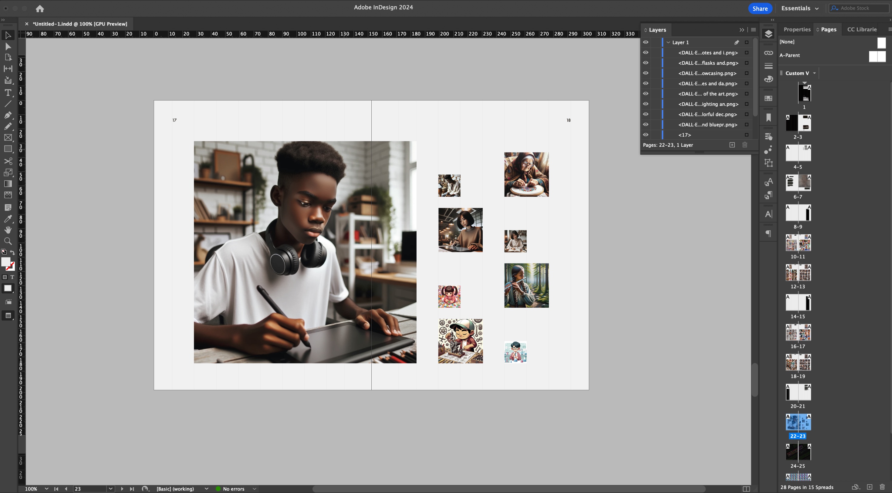
Image of: Restructuring the content to be more print-friendly.
Conclusion and Post-Mortem
Looking back at the start of this semester, it was great to have seen the ideas change so drastically. I had actually already planned a graduation project idea from when I first entered Lasalle, and to watch that idea change over the past 2.5 years here, is quite interesting.
Overall I’d say I’ve learnt a lot just from this project alone. While not entirely “design-related” or related to any form of visual communication, I still feel they are mostly important skills. It’s not so much that I somewhat know python now, or that I somewhat know how to do what the smaller a.i. companies are doing where they’re just building interfaces around models. It’s more of the fact that I would now know how to adapt in such a scenario in the future, which as a transferrable skill, I feel is way more important than just knowing about the technology.
There are many ways my project could have been better overall, but honestly with the time and resources (aka money) available to me, I feel this is the best I could have done with my current capabilities. Also, not forgetting the fact that the project looks almost nothing like yet another digital product or solution, which was my goal from the start.
I’d say that at least personally, the project definitely feels quite on track. I’d like to say that I look forward to what comes next semester. However, it’s not like I don’t already know seeing as how after this round of submissions is when the preparation work for revamping the technical prototype really begins.