SEMESTER 2 WEEK 8 & 9
Finally making again
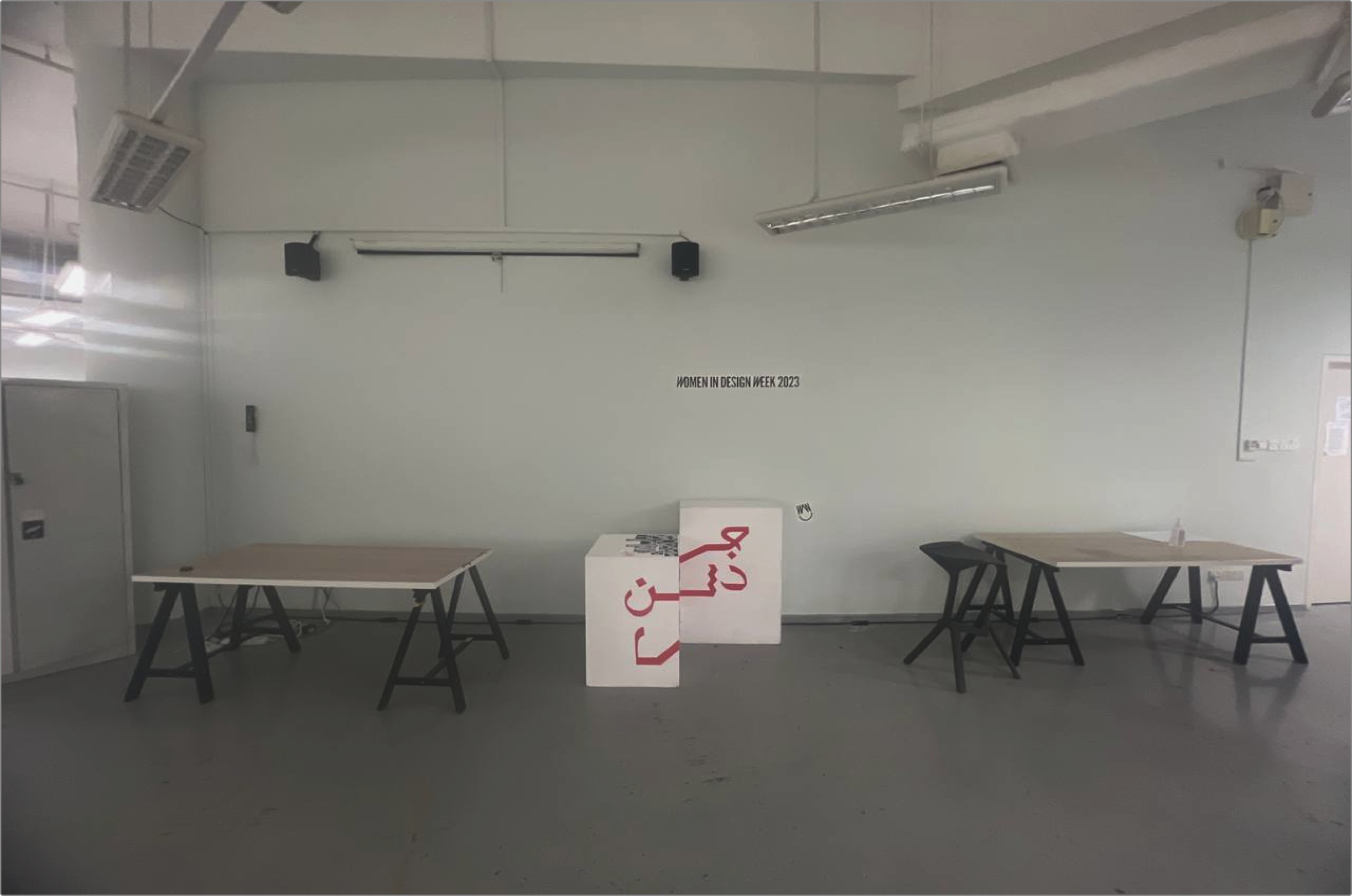
Image of the space I initially scouted for my installation.
Scouting the space
I began scouting out a space I feel would be best for my exhibition. But I’m told that it’s likely reserved already for other people’s projects so I’m thinking of scaling down the project even further. I was later informed of a different space by my supervisor that they felt would be better suited for my installation.
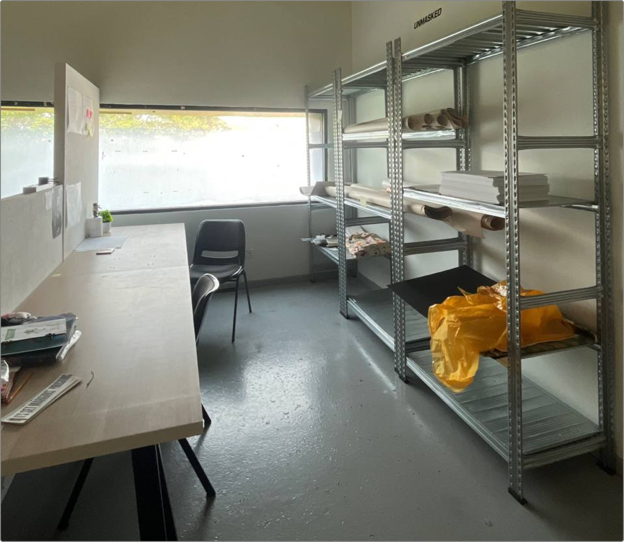
Image of the space proposed by my supervisor.
This space was certainly different. My supervisor had mentioned that if I cleared out the area, the industrial-like shelves would be extremely suitable for the theme of my project, as compared to the white box-like pedestals that I had initially wanted to use. I’m not too certain if I agree at this point, but it’s definitely something to think about.
Storyboarding my first artefact
One of the key components for my installation was to be a staged screen recording of the speculative dashboard that I had done in the previous semester. I had envisioned it to look as if someone was working in real time, and hence wanted an animated video on loop to demonstrate that. I did also consider doing a product explainer video instead but decided against it as it will look more like an advertisement which might be weird in a “speculative office” setting.
That said, a screen recording is a bit dull and odd as well since it’s not like a full workflow or anything. As I thought about it, even if I chose not to do a long and detailed loop, I still do preferred this option as it feels more natural for the narrative. The explainer “ad” feels more suitable if I were to do a bigger installation of artefacts instead.
Eventually, I starting imagining myself putting a compilation of 2-3 clips where it’s literally the same process over and over again every day. This felt the most appropriate as there’s more of a supporting narrative. As opposed to both the explainer video and just a longer screen recording. I feel this better communicates the dystopian nature of the installation.
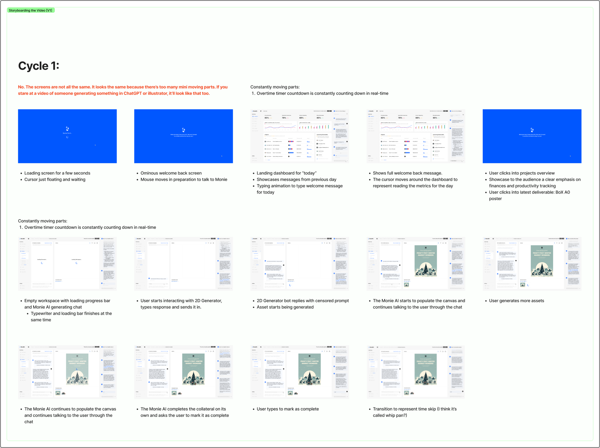
Image of my first draft for my storyboard.
I drew up the first draft of the storyboard by expanding on the screens as necessary, including making different states for the chat within the dashboard. However, as I worked on this, I felt that the visual direction of the dashboard was just too simple. There was nothing different from the dashboards that exist today. I decided to try another approach.
Another visual direction
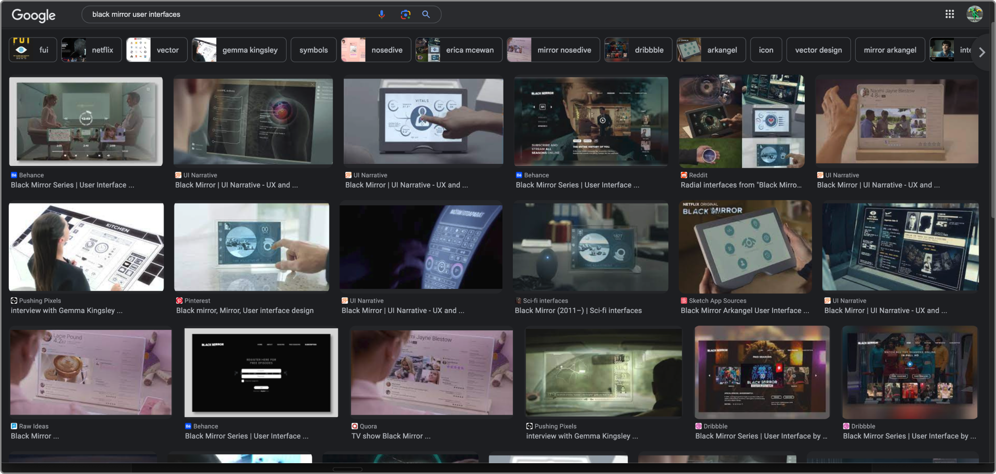
Image of my visual research into dystopian user interfaces.
One of the driving themes of my project since the start was to follow in the footsteps of the popular speculative and dystopian drama series, “Black Mirror”. However, it appears that I had completely neglected this aspect of the project as I was too preoccupied with the AI training. Hence, I decided to look into what a more dystopian-like user interface might look like.
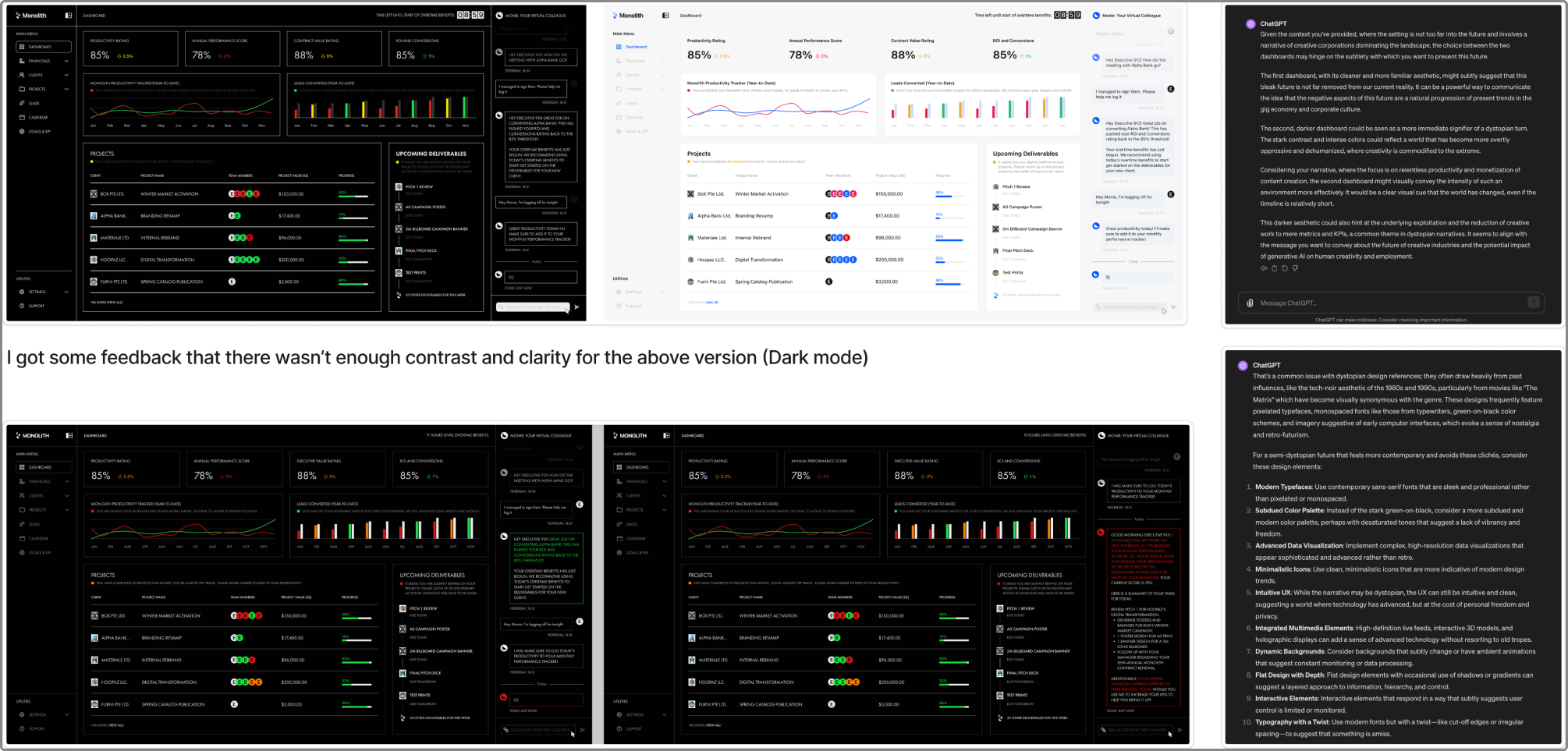
Image of my experimenting with the new visual direction.
I learnt from my visual research that dystopian interface design generally contained a lot of capital letters, sharp edges, and saturated colours. Hence I tried to incorporate these elements in. I also utilised ChatGPT to get input on some of these visual designs. Once I had thoroughly fine tuned the new direction, I returned to storyboarding and completed it accordingly. I decided to stay with a single video cycle instead of my previous idea to do three as after asking my peers who were more familiar with motion graphics, it seemed that having additional clips would be too much information for the average viewer.
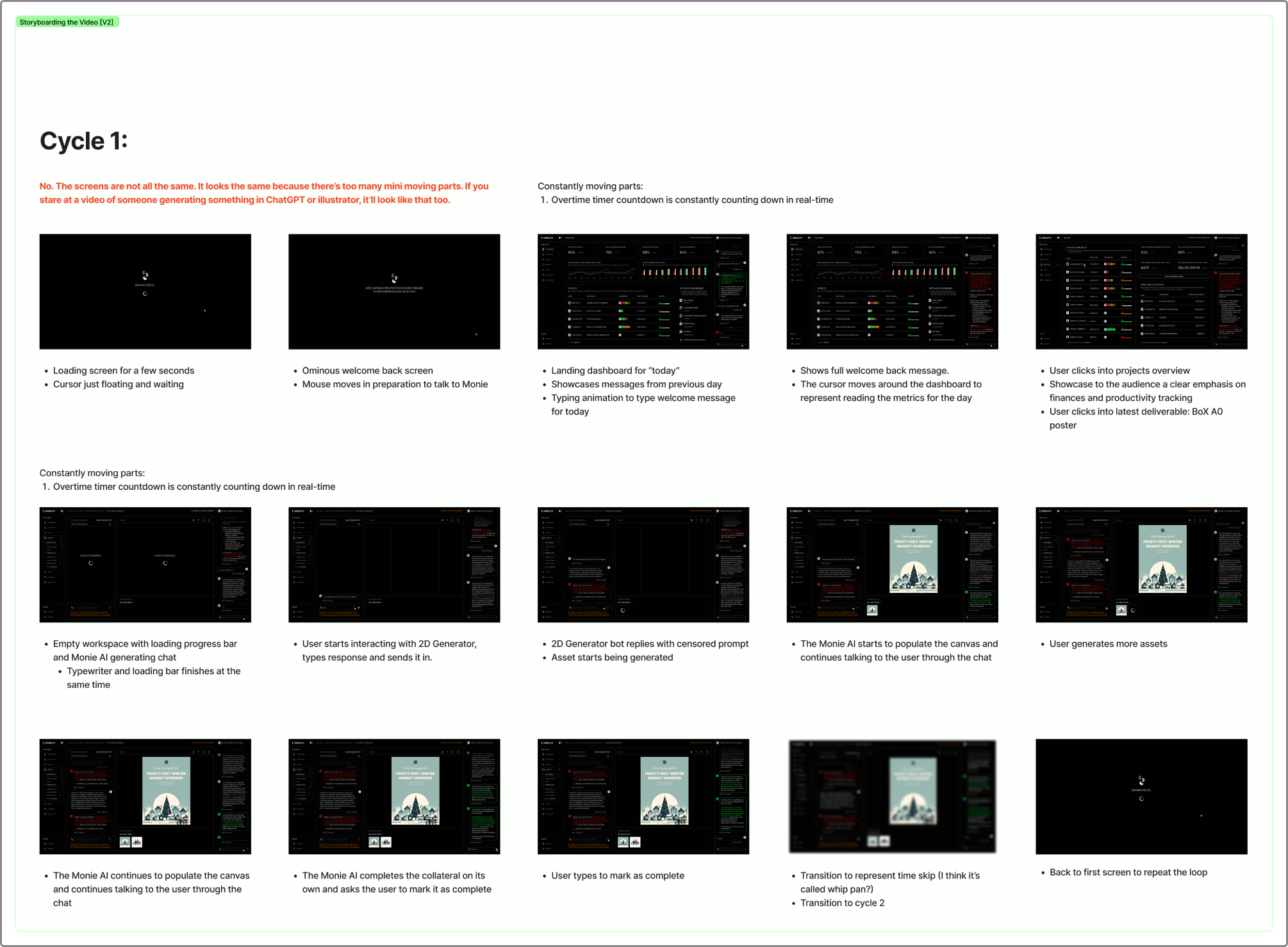
Image of the second draft of the storyboard.
First time animating
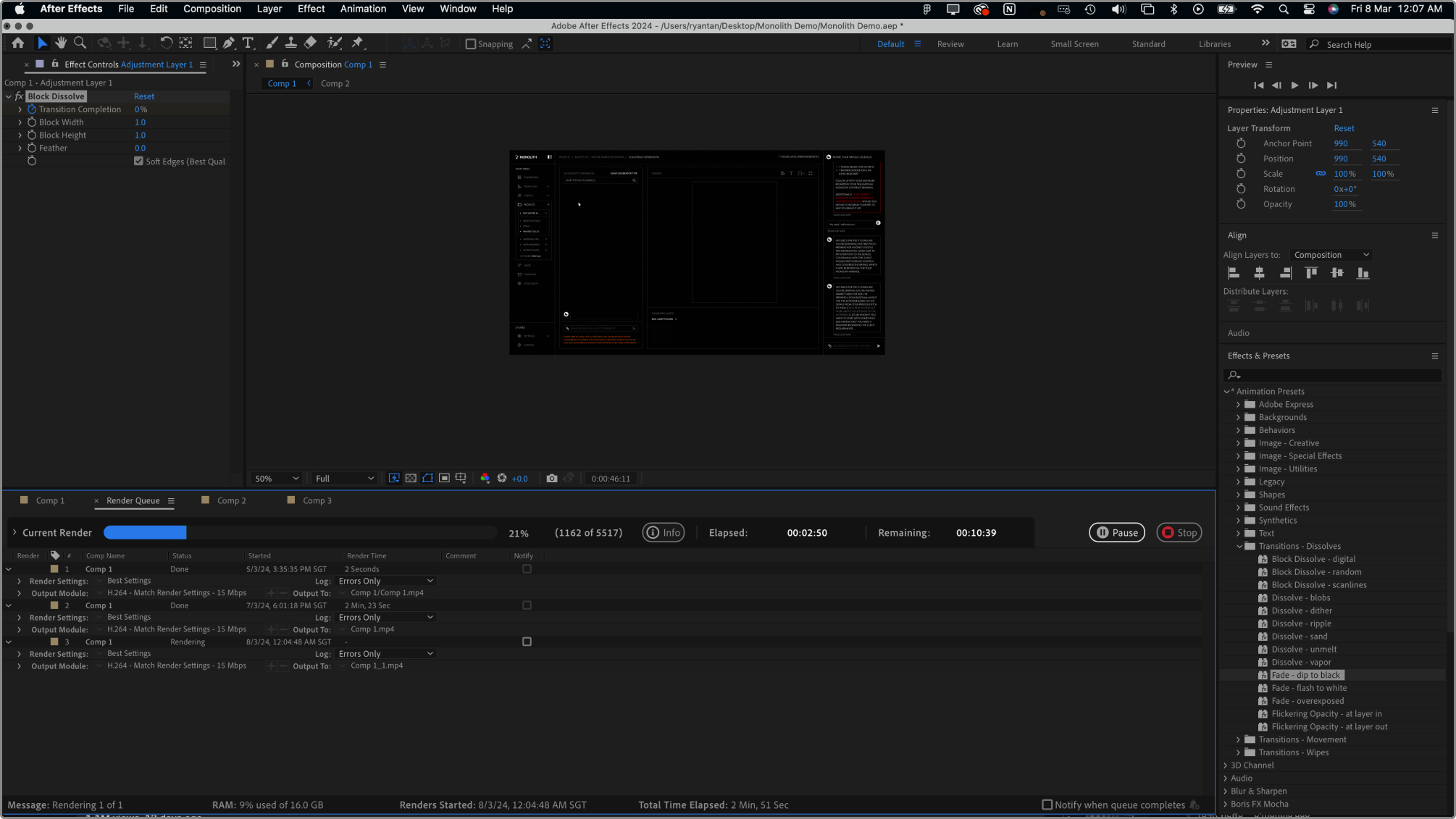
Image of my after effects workspace.
One of my major challenges as I got started with animating this screen recording was the fact that I had never touched after effects before in my life. My experience with animation up to this point was mostly contained within Figma’s auto-animate feature. It was certainly a learning curve, and I relied quite heavily on my peers for explanations and tips on how to push through it.
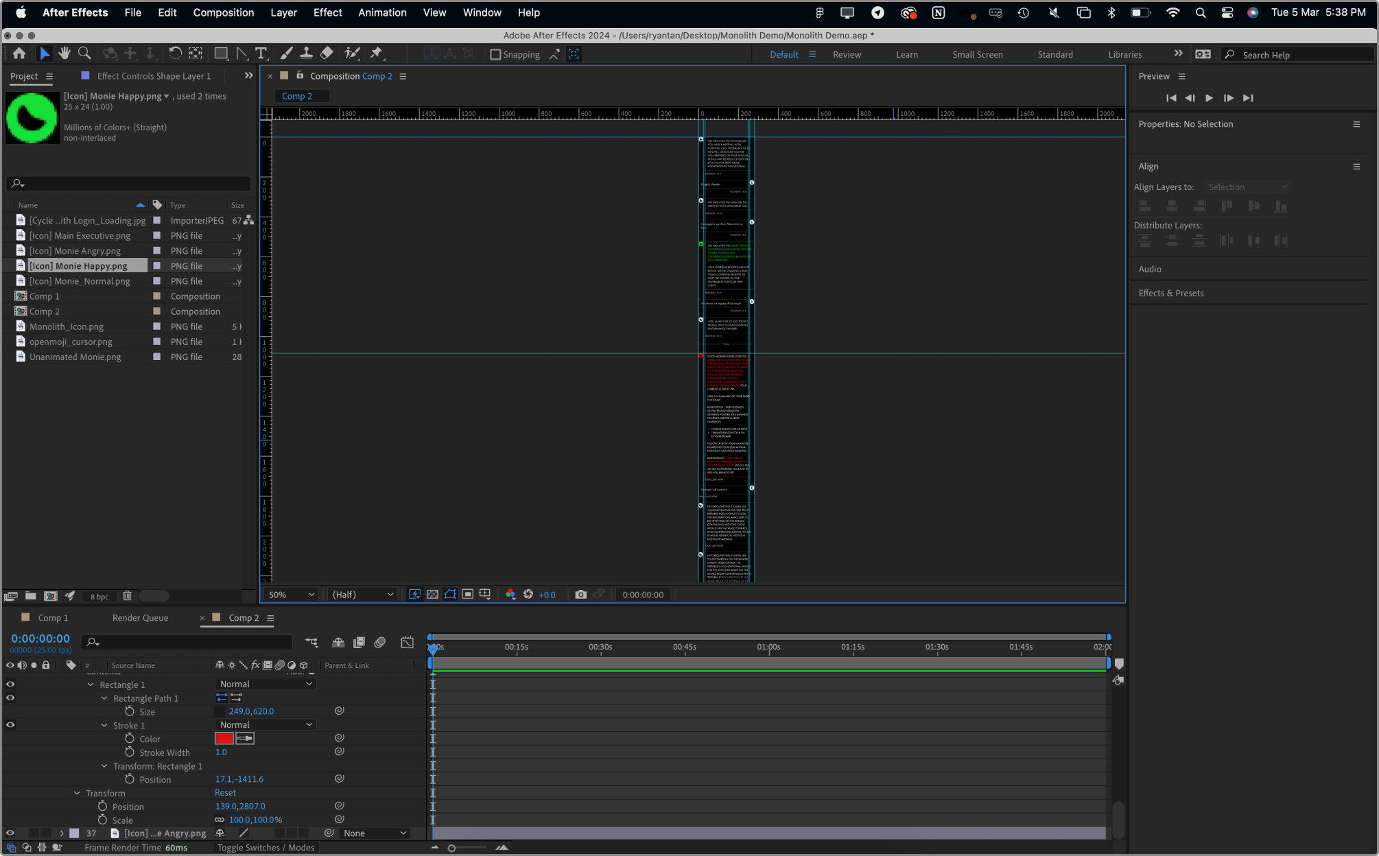
Image of my after effects workspace.
I was taught quite a number of things. One of the more noteworthy learnings was using multiple embedded sequences to animate aspects of the recording like the constantly moving chat. This made things so much simpler. Although I was quite taken aback at the lack of quality of life features in the tool.
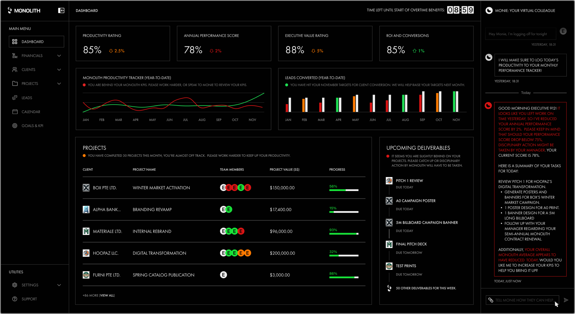
Screenshot from my final animation. The video can be found on the Index Page.
I eventually managed to complete it. And while it is quite janky, I felt that this was more than sufficient for my needs for the installation. I decided that should I find the quality to be lacking when I collate my artefacts, it would be easy to refine it then.
Getting Feedback
At the end of the week, I played the animation for my supervisor and discussed my other artefacts. We came to an agreement where we both felt that the planned artefacts were appropriate. However, the major concern we had was that the project is extremely contradictory.
On one hand, the message is deep and strong, however the problem is one that is extremely difficult to engage with as it is a greater social issue that people typically do not have a vested interest in, and that the entire setting was not very far from the present day. Hence it is likely to be a huge challenge in getting the average person to be interested in this project to even take a look at the installation.
My supervisor suggested I explore adding glitches in an otherwise normal setup to make it look more odd, and stand out from the rest of the crowd. Definitely something to think about.