SEMESTER 2 WEEK 13
Collating all assets
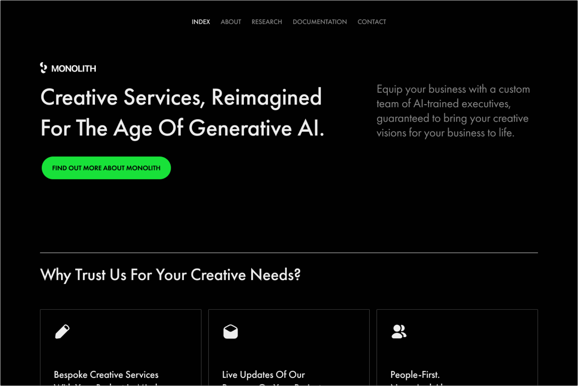
Image of the new Monolith home page.
Revamping the project website
One of my major goals since the first semester was to package my entire project as a single medium that is easily accessible. Over the weeks I did consider doing publications, and even multiple publications. However, the more I considered, the more I felt that there was more value in collating my work in a website that can be accessed any time and anywhere, rather than doing up a publication for the sake of grading, after which it would simply be locked up somewhere.

Screenshot of me ideating the home page.
My main objective for the landing page was to design it as if it were a real company in this speculative scenario. I wanted the theme of the entire website to align with this direction as well. To do so, I used typical marketing design languages and product mock ups, as well as page headers like “research” and “documentation” to really drive this effect.
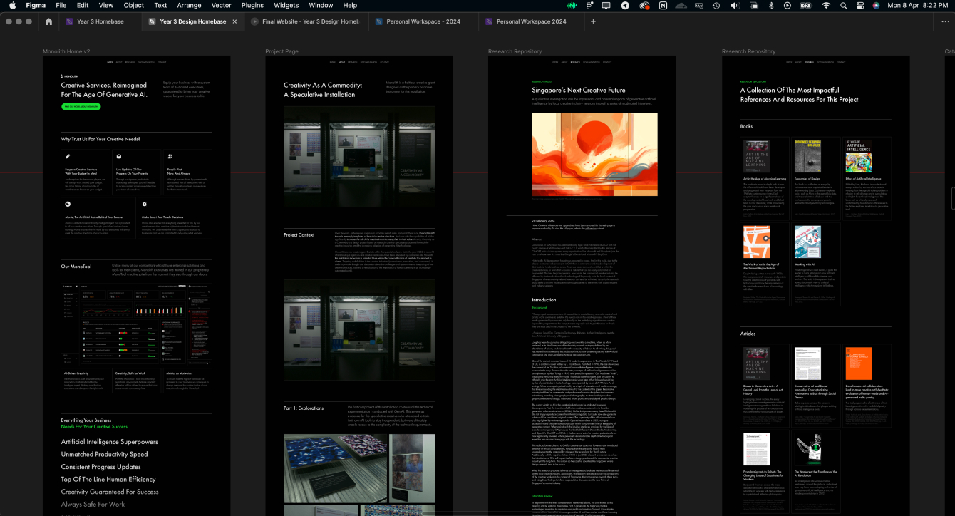
Image of an overview of the completed main pages.
I also referenced OpenAI’s design aesthetic quite heavily here. Oddly from my observation, they are one of the few AI companies that actually have a decent design layout while preserving that “corporate” aesthetic. All the others have designs that can be considered quite outdated. Once I was done with the main pages, I moved onto the final page which was the catalogue of making.
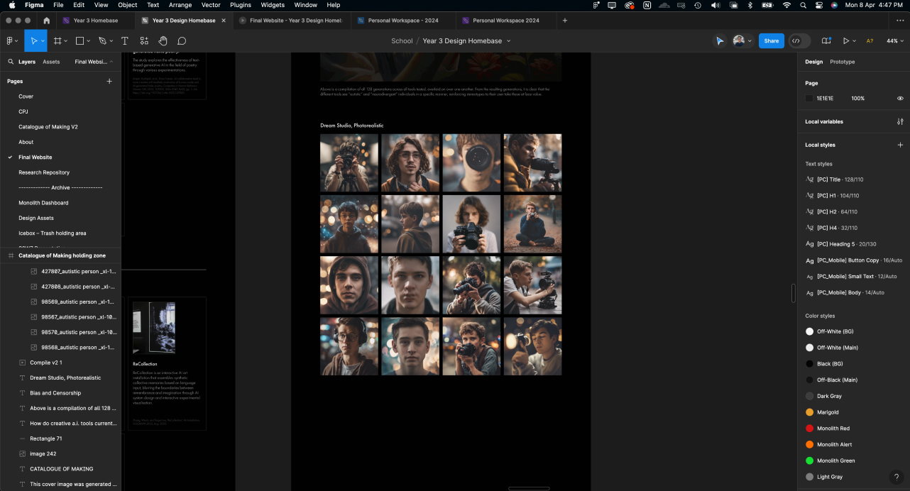
Image of me working on the catalogue.
In the previous semester, I struggled with finding balance for the catalogue of making. I was quite obsessed with making elements fly around and animate, but with this new direction, that wasn’t necessary. Hence, I was able to finally collate all components of the project as a single website. I decided to class this page under research as it did seem fitting, it being experiments and what not.
On that note, I was done with the design revamp of the project website. I tried my best to stay true to the design system that I had created with the dashboard and the rest of the installation. To which, I think I did succeed quite well in this regard.
On that note, I was done with the design revamp of the project website. I tried my best to stay true to the design system that I had created with the dashboard and the rest of the installation. To which, I think I did succeed quite well in this regard.
What it could have been
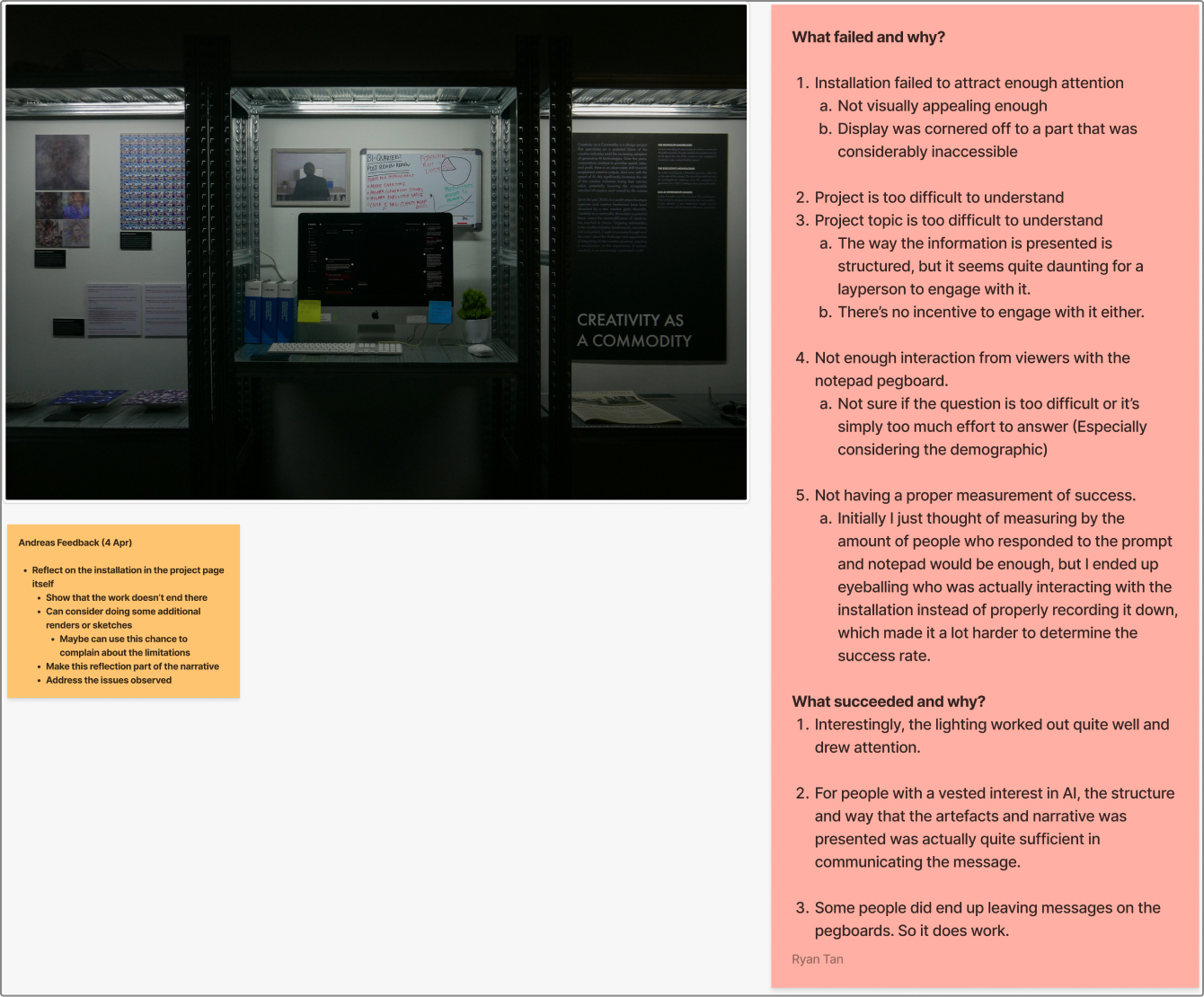
Image of me retrospecting the installation
As mentioned in the previous entry, the installation can ultimately be considered as a failure due to issues surrounding demographical differences. This week, I took some time out to truly analyse and understand what succeeded with the project, what failed, and why they happened.
I was able to come up with a list of issues, to which I attempted to resolve with a prompt I created for myself, “What would I do if I could redo it from scratch?”
I was able to come up with a list of issues, to which I attempted to resolve with a prompt I created for myself, “What would I do if I could redo it from scratch?”
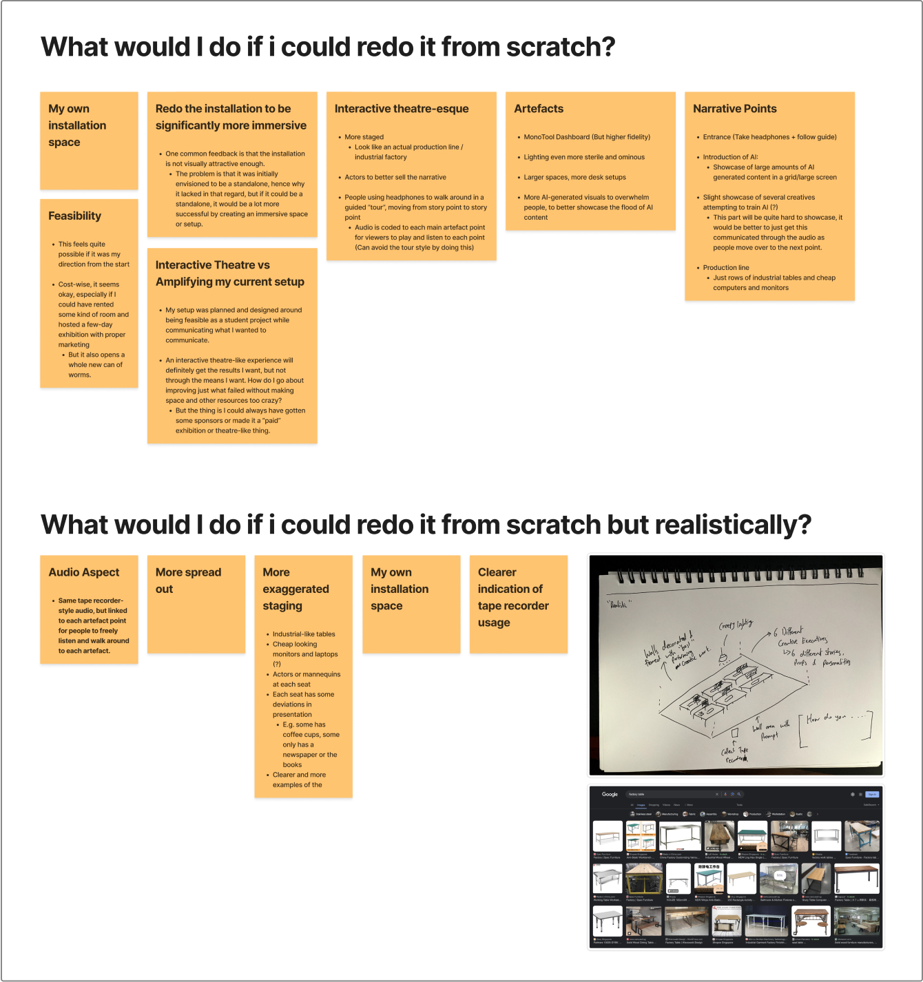
Image of my ideation session
I considered two scenarios. One where I had little restrictions, and one where I had pretty much the same restrictions as I had now. When tackling the first scenario, I was able to come up with a lot more ideas, several of which were definitely stronger. One of the options I considered was full-on interactive theatre where I would rent an apartment, hire actors, and so on. That would have been nice.
However, the more I considered the plan, I realised that there was no point to that since it would be easy to just remove all obstacles. Hence, I restarted this ideation with the second scenario. I attributed the main issue with my project to my distracted planning efforts. The main issue I noticed was the fact that I was unclear of the exhibition space from day 1, and hence was unable to execute it properly. Instead, I was just adapting on the go, and that resulted in a project that had shrunken down in scale.
In the end, I still felt the best way to communicate this complex topic was through an installation that one could experience. Similar to the work by Superflux, even the average layperson would be able to appreciate a dystopian setting. Especially if I could find the space for it somewhere, and do proper marketing and outreach for the exhibition.
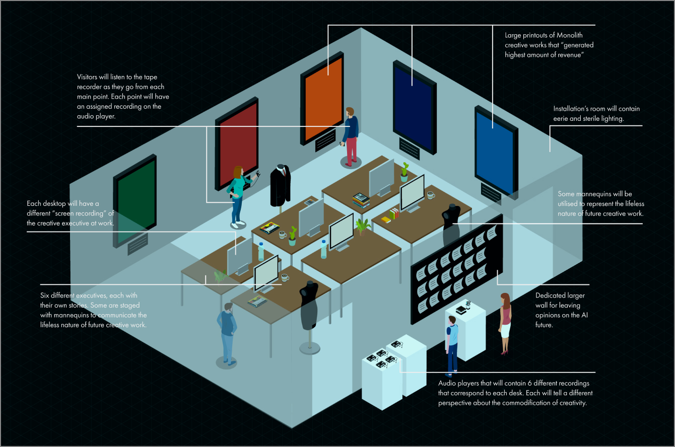
Image of my new blueprint.
Hence, I drafted a new blueprint based on this ideation session. This new layout mostly stays true to the first iteration but was expanded based on its strengths. One of the major flaws with the first iteration was the fact that it was just a display shelf, rather than an actual immersive environment. In the new blueprint, I centred my planning around a small office space, one that would be easily accessible (logistically). By doing so, I would be able to control the actual environment, from the lighting to the ambience, sounds, smells, etc.
Through the new blueprint, I also simplified the narrative. Rather than being cut into three components from three time periods, I restructured the narrative to fit the same time period from potentially six different perspectives. So the participants would take an audio recorder, walk from desk to desk, and be able to listen to the speculative creative’s story and reflection. The desk would also be set up properly, and have video recordings playing on a loop, similar to my first iteration. Just that each desk would have a different recording.
Honestly, it is quite hard to measure the potential success of this new iteration, and there would need to be a significantly more tinkering to refine it, but at the very least, it does address the major issues I observed with the first iteration. Additionally, it should serve as a good starting point should this installation be exhibited again.